Netflix Stories
Netflix Stories is a mobile interactive game included with a Netflix subscription where players experience visual-novel, choose-your-own-adventure gameplay.
Players customize their character, read through dialogue-driven scenes, and make choices that influence relationships and story outcomes in stories based on Netflix shows like Emily in Paris, Outer Banks, Love Is Blind, Selling Sunset, Perfect Match, Virgin River, and Sex Education.
Trailers for multiple stories in Netflix Stories
Role
UI/UX Designer
Company
Netflix
Boss Fight Entertainment
Background
As one of the first UI/UX designers on the team, I helped shaped the product from concept to launch and continued supporting it through live-ops updates such as the Hub redesign and new story additions. This marked Netflix’s first interactive fiction game featuring multiple major IPs and achieved 10 million downloads.
The game primarily functioned as a marketing extension for Netflix series, designed to maintain audience interest during gaps between seasons. To achieve this, the team focused on rapidly releasing a high volume of stories across multiple series. The goal was to immerse players in each show’s universe through emotionally engaging, romance-driven narratives, some of which included mature and sensual themes.
Key Objectives
Deliver an inclusive gaming experience by designing intuitive UX and accessible UI for players of all experience levels, while creating visually engaging interfaces. Support strong DAU and retention through thoughtful, player-centered design.
Technical Constraints and Design Restrictions
Designing Netflix’s first dedicated game hub required navigating uncharted territory while adhering to the platform’s existing UI/UX hierarchy and structure. Key decisions included determining game orientation, standardizing or customizing flows and screens, and defining the extent of game-specific UI. The challenge was to create an intuitive, user-friendly interface that also offered rich customization options to engage diverse player demographics. The project operated on a fast-paced schedule, with Netflix aiming to release a new game roughly every month. Additionally, technical complexities—such as linking subscriber accounts to the hub and hosting multiple games within a single platform—required careful problem-solving to ensure a seamless experience.
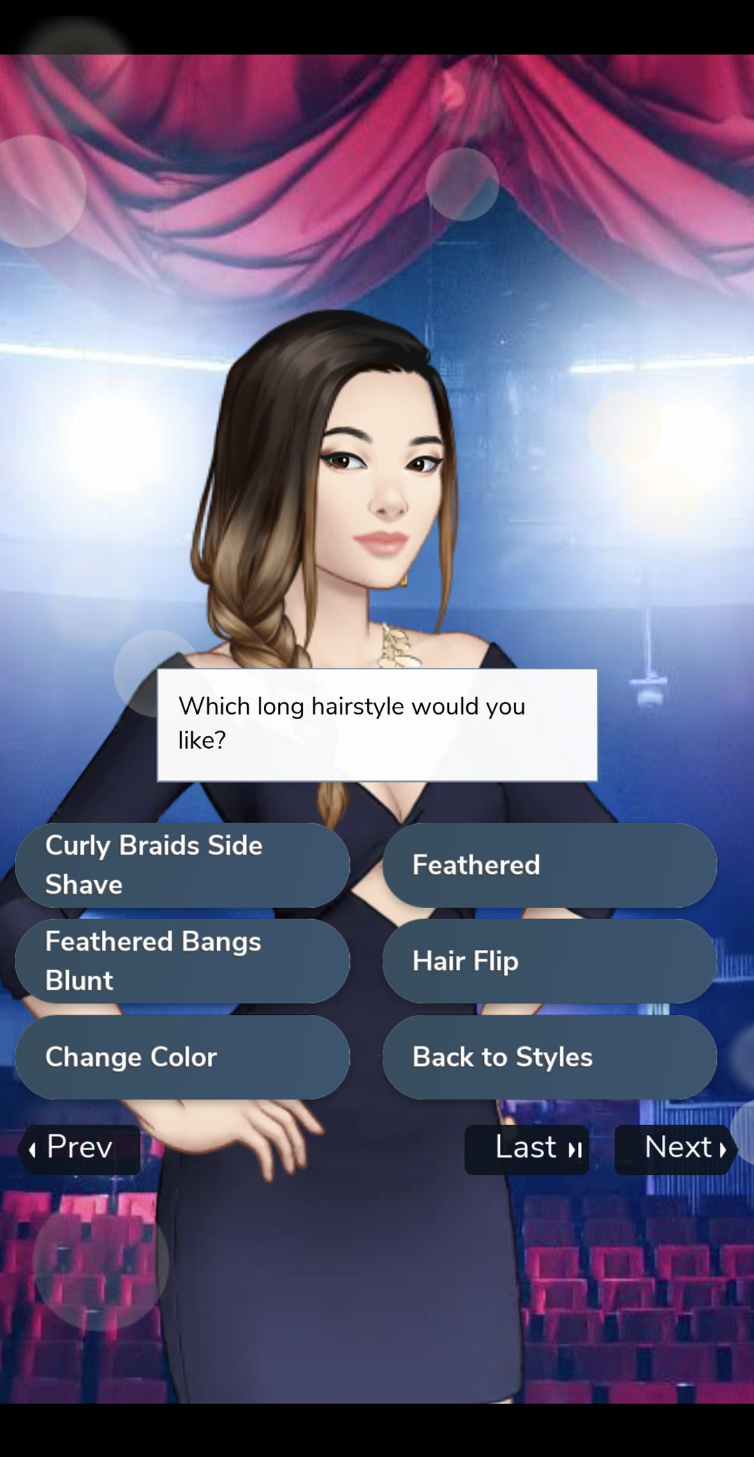
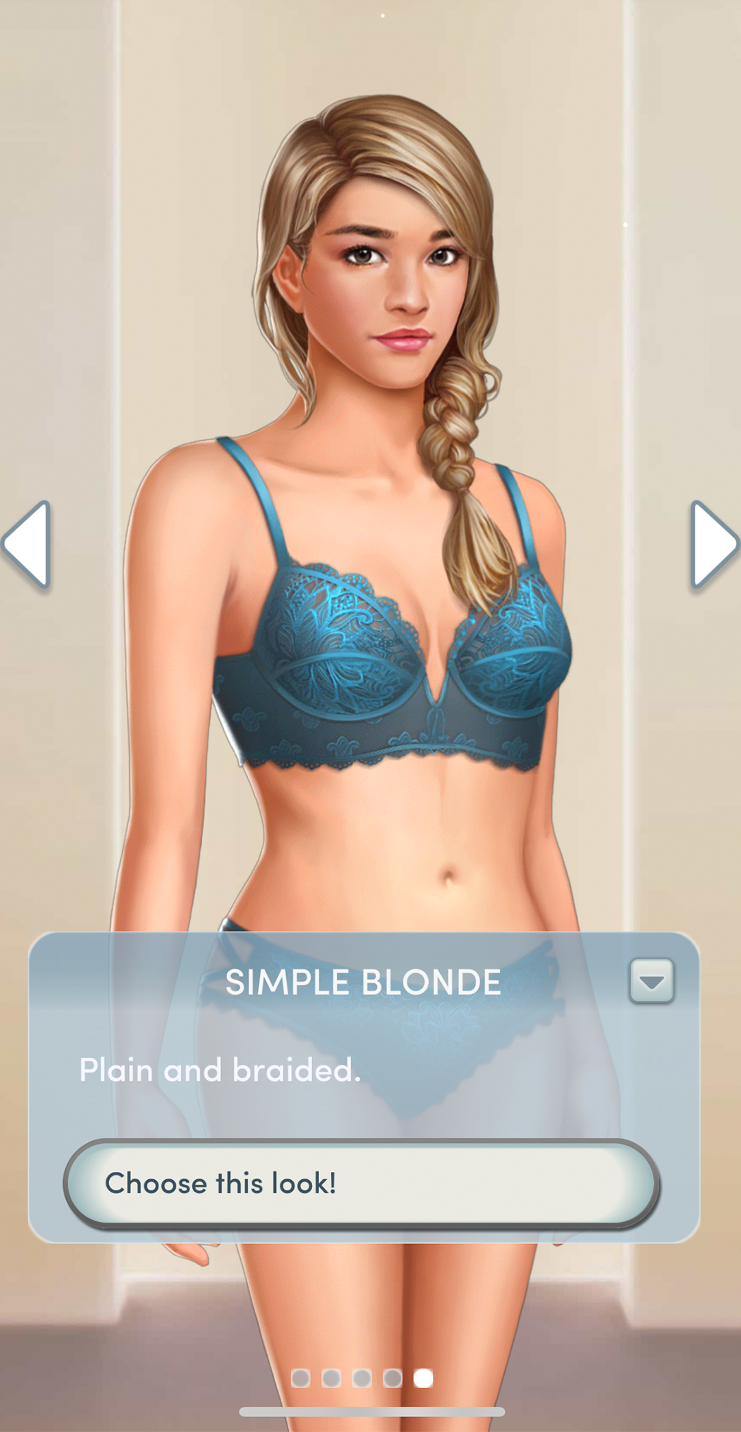
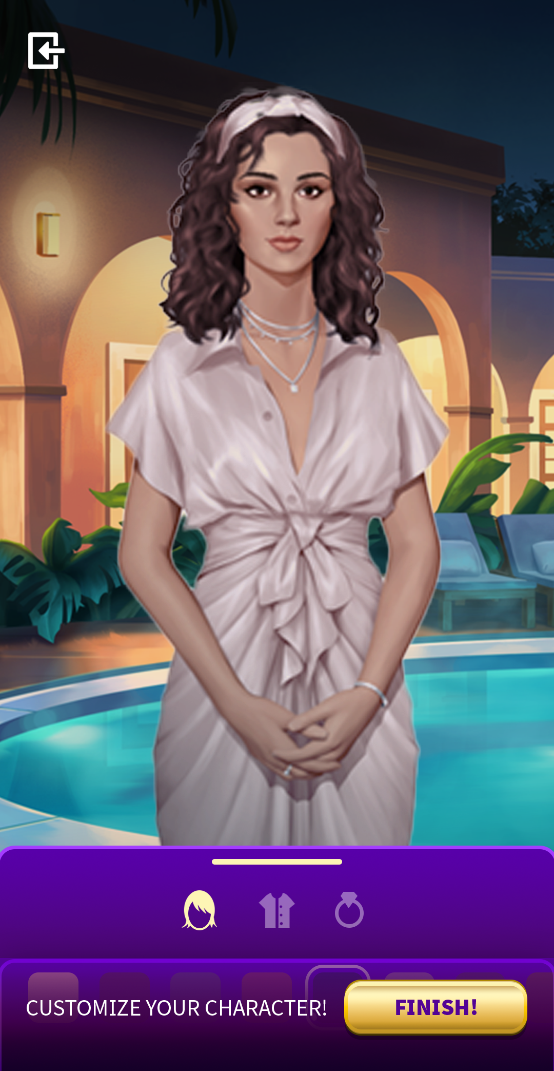
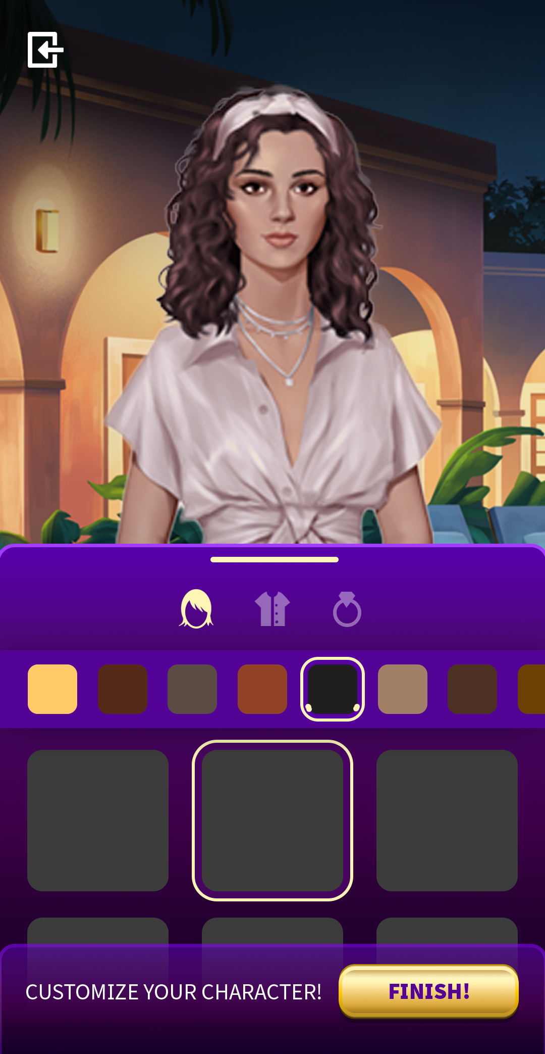
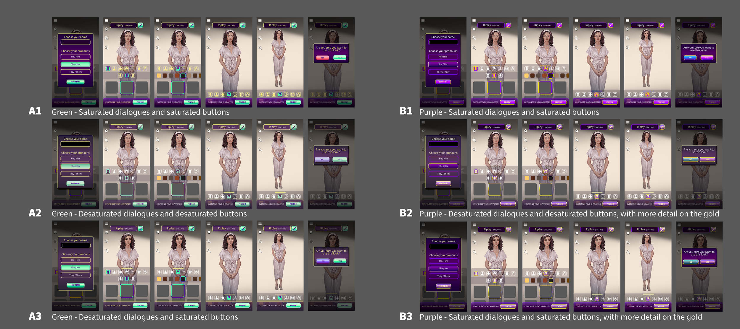
I designed the Character Creator
Originally intended for Netflix Stories’ debut title, Love is Blind, this design was so successful that it became the foundational template for the entire hub. Each subsequent story used the same core structure while incorporating unique color palettes and visual elements tailored to its respective series.
Objective
To design a Character Creator that allows players to customize the main character to their preferences, with a scalable system capable of supporting future customization options. The experience was built in portrait orientation, and needs to ensure full-body visibility of the character.
Design Process
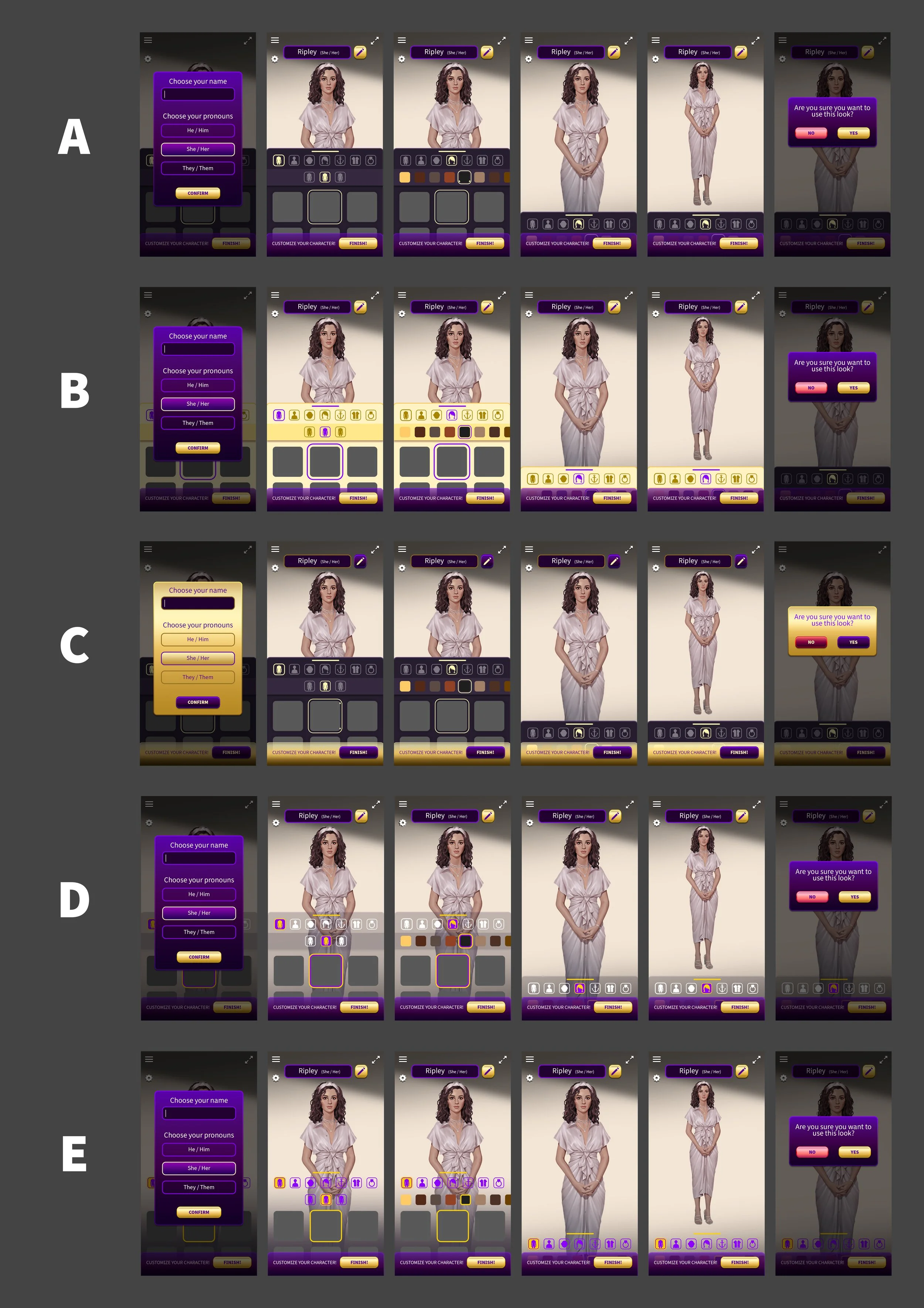
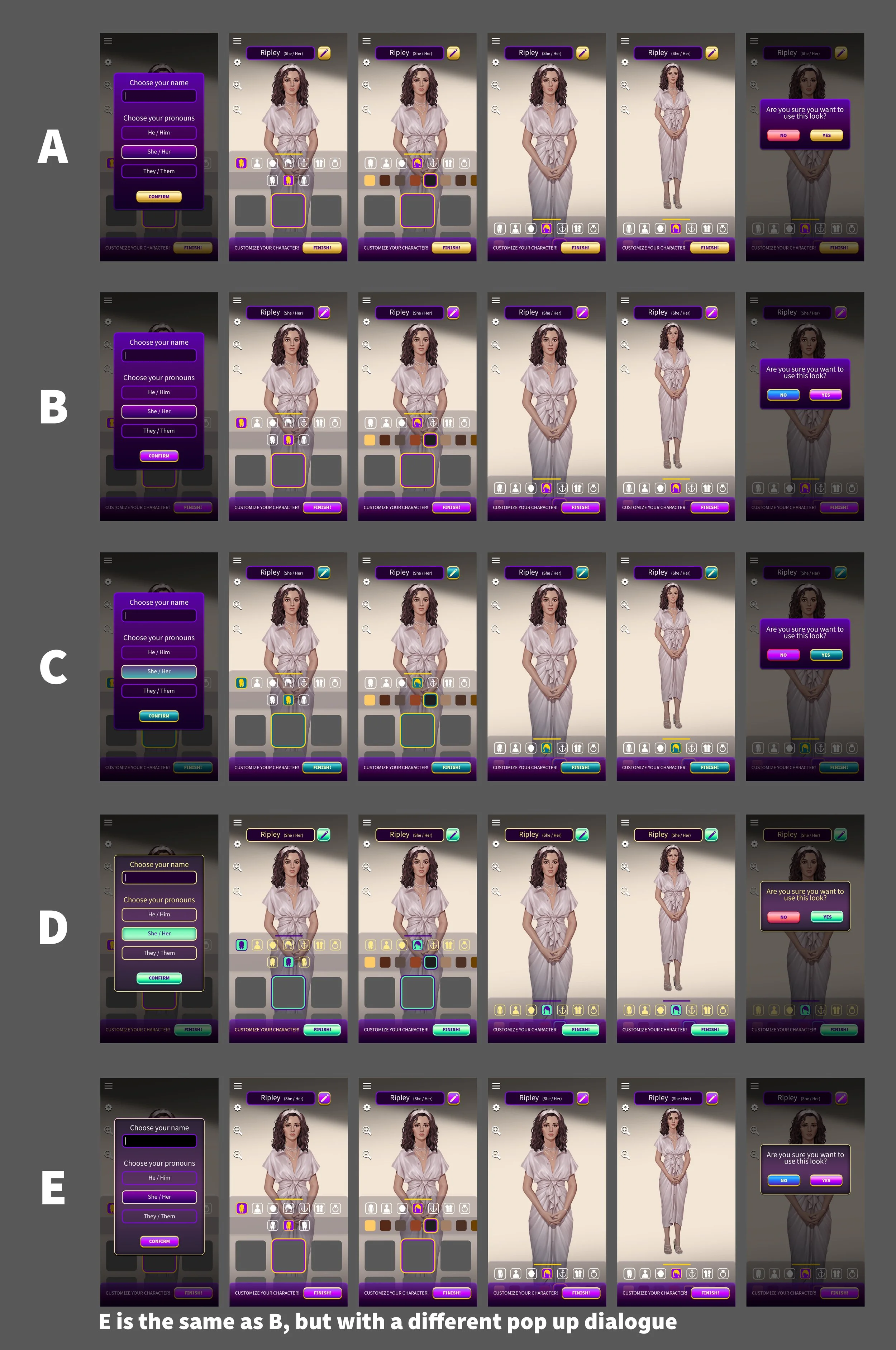
I began by researching competitor character creators, evaluating their strengths and weaknesses. This analysis helped identify key pain points to address, while also highlighting successful elements to refine and improve in our own design.
My research revealed that none of the competitor character creators allowed players to minimize the customization panel to view the character’s full body. While Too Hot to Handle supported zooming in and out, it was still difficult to see the entire character at once. Other competitors, such as Choices and Episodes, introduced significant interface friction: navigating options required excessive tapping, reversing decisions was cumbersome, and players could not preview customization choices before selecting them. Instead, each option had to be applied to the character before its appearance could be evaluated.
I then conducted iterative wireframe explorations to assess layout efficiency and interaction patterns, with the goal of minimizing friction and creating a seamless, user-centered customization experience. I focused mostly on how to reveal the full body visibility of the character.
(NOTE: Stakeholders requested visuals beyond basic greybox wireframes.)
Choices
Episodes
Too Hot to Handle
After aligning with stakeholders, engineers, and artists, we finalized the layout and moved into color exploration. The color palette was designed to align closely with the established Love Is Blind brand and visual theme.
This step was also used to explore shape language and refine the final design of each tile. I also collaborated closely with the Showrunner and writers to refine the UX flow. This step was critical for immersing the player while ensuring the pacing and tone aligned with the narrative.
Final Design and Flow
After exploring multiple iterations and working within technical limitations, we settled on a design that lets players see every customization option before applying it. The final reveal adds a sense of excitement, drawing players deeper into the game’s universe.
Leading into the Character Creator
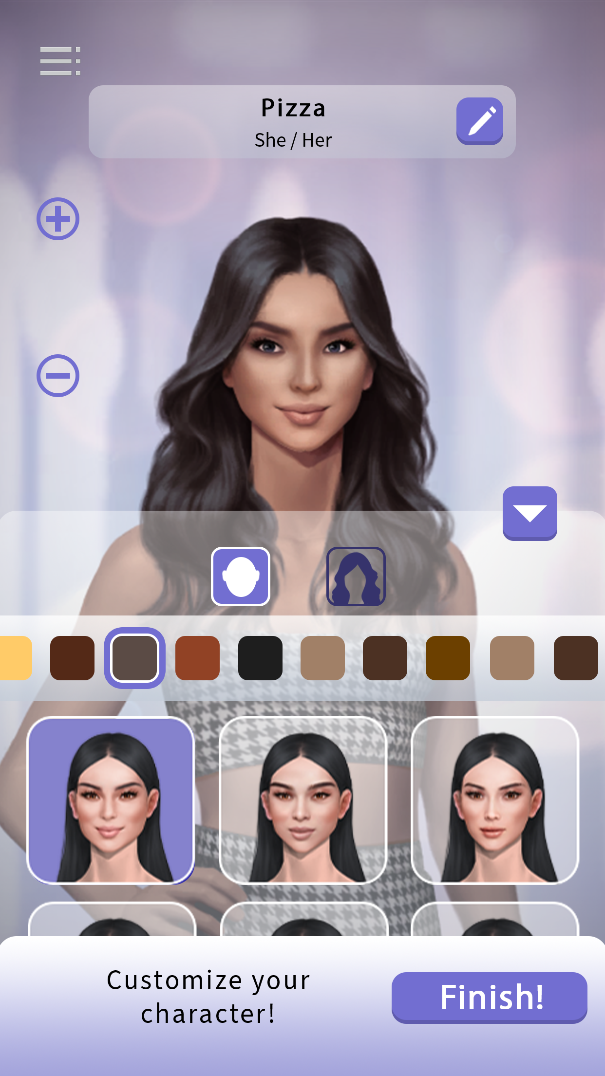
Character Creator - Face Options
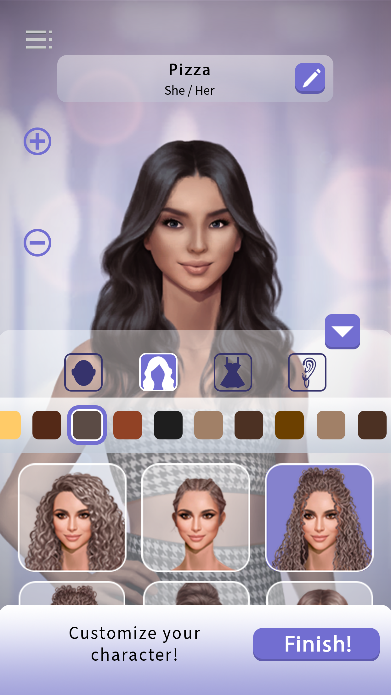
Character Creator - Hair Options
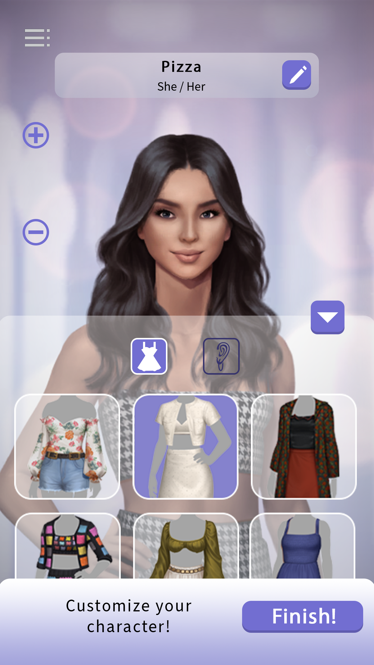
Character Creator - Outfit Options
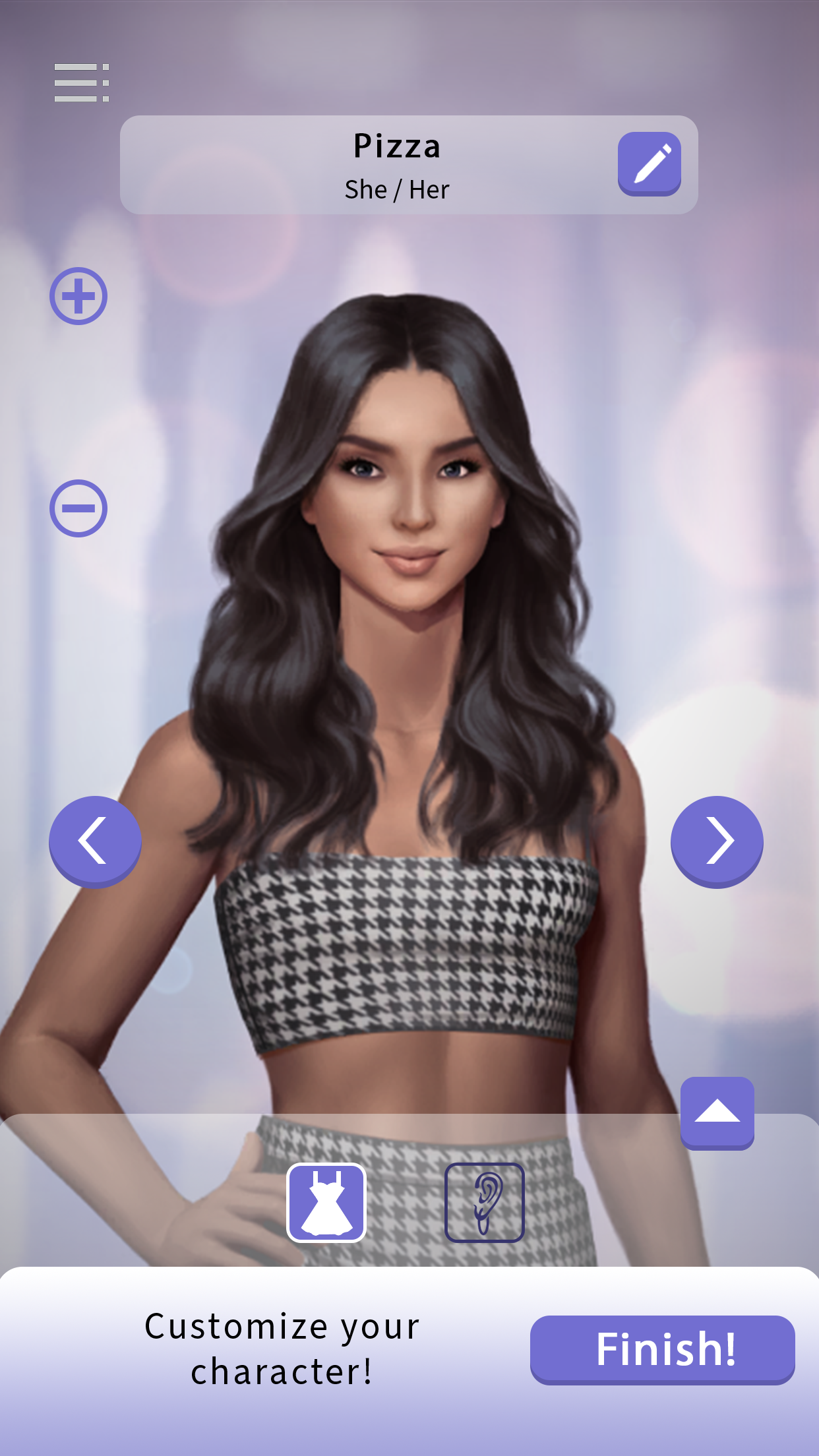
Character Creator - Full Body
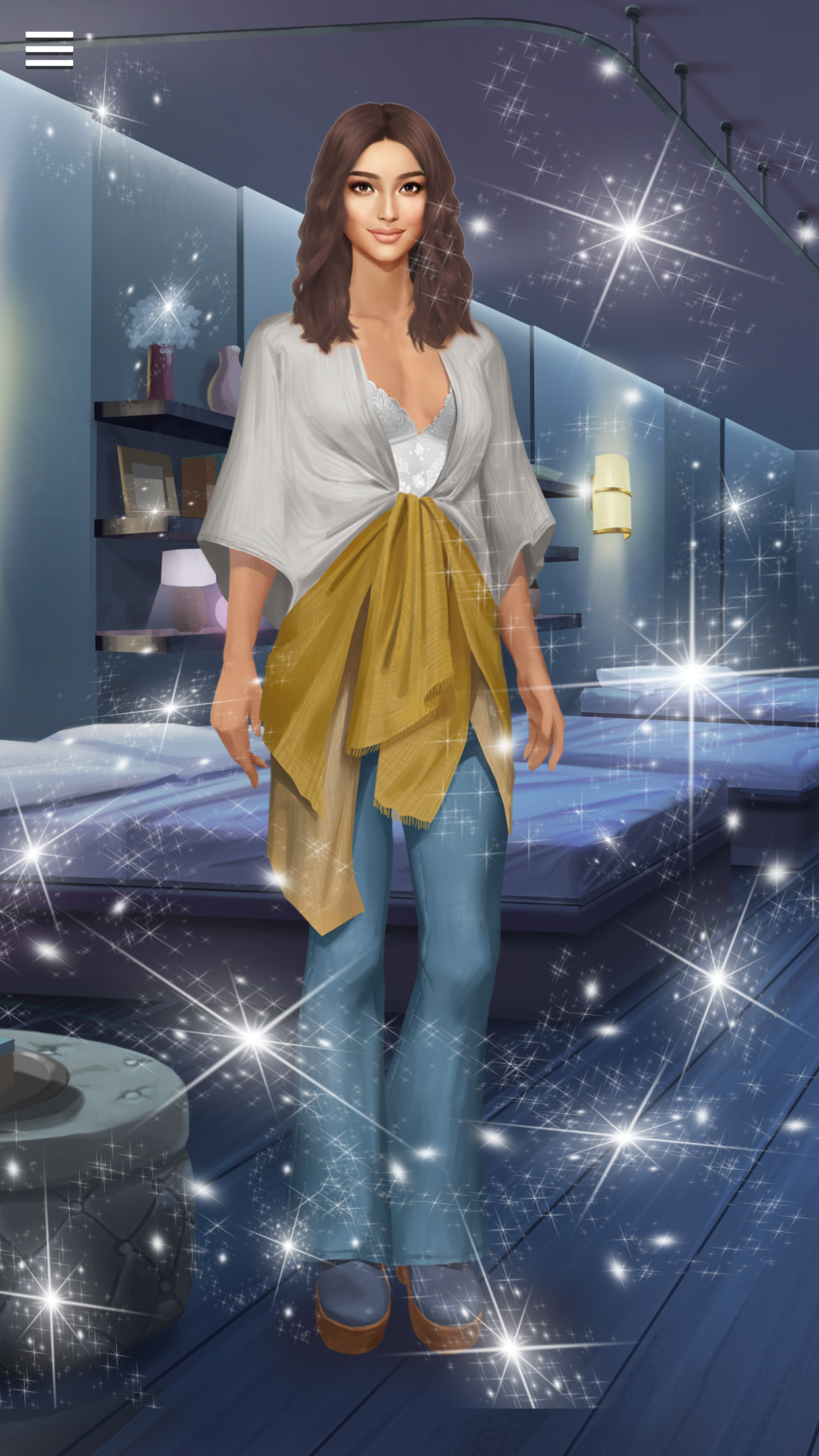
Customized Character Reveal
Customized Character in Game
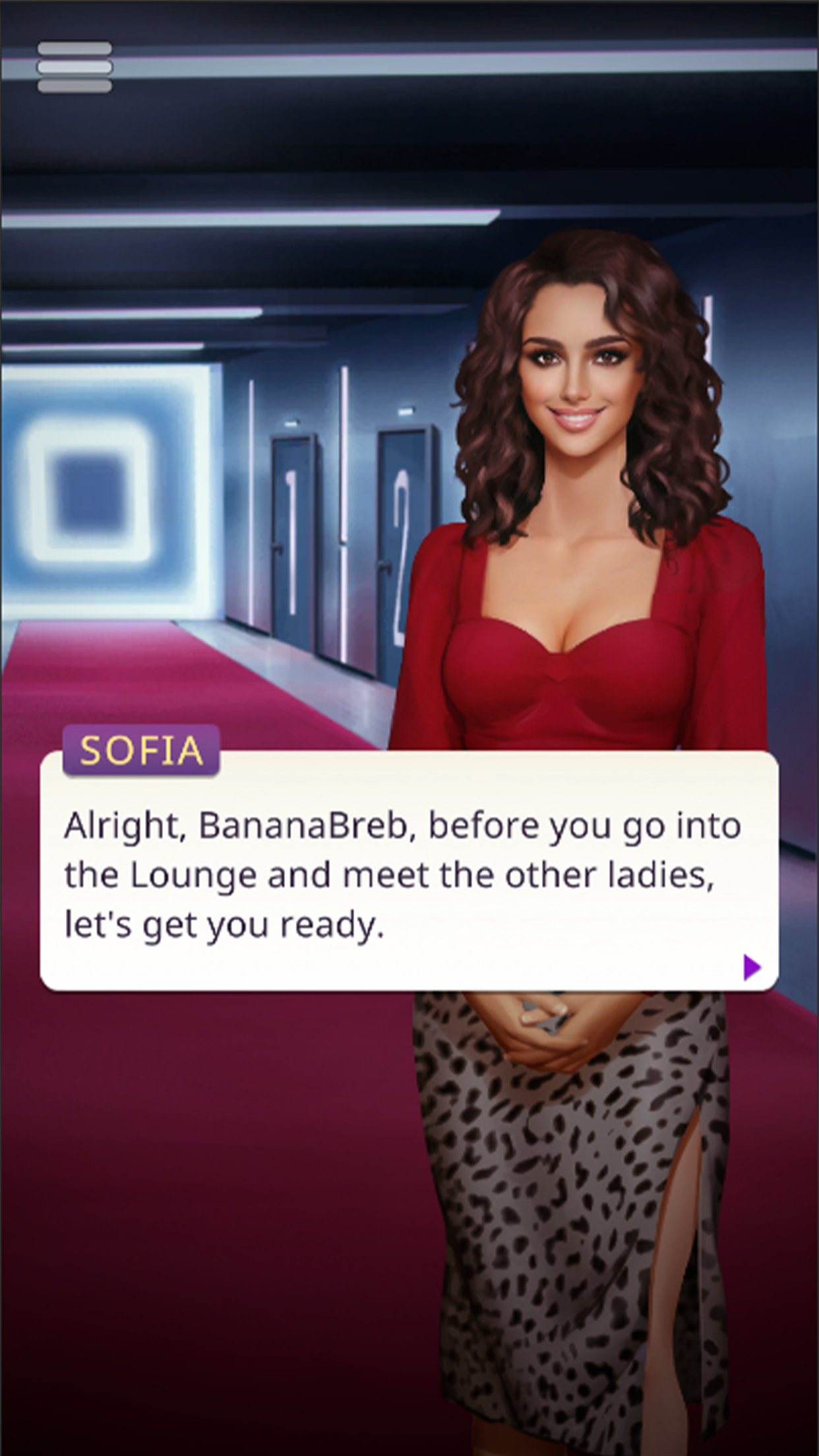
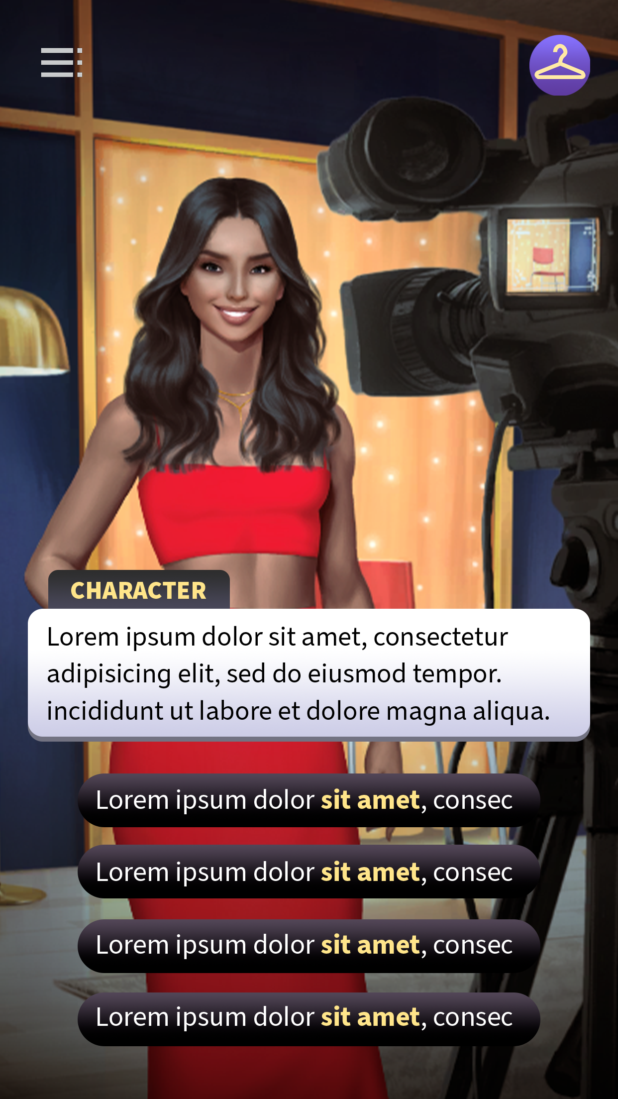
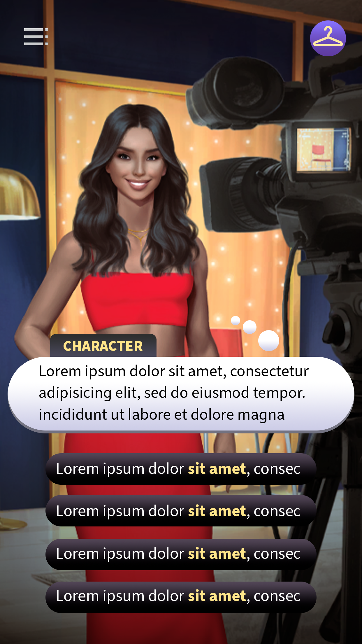
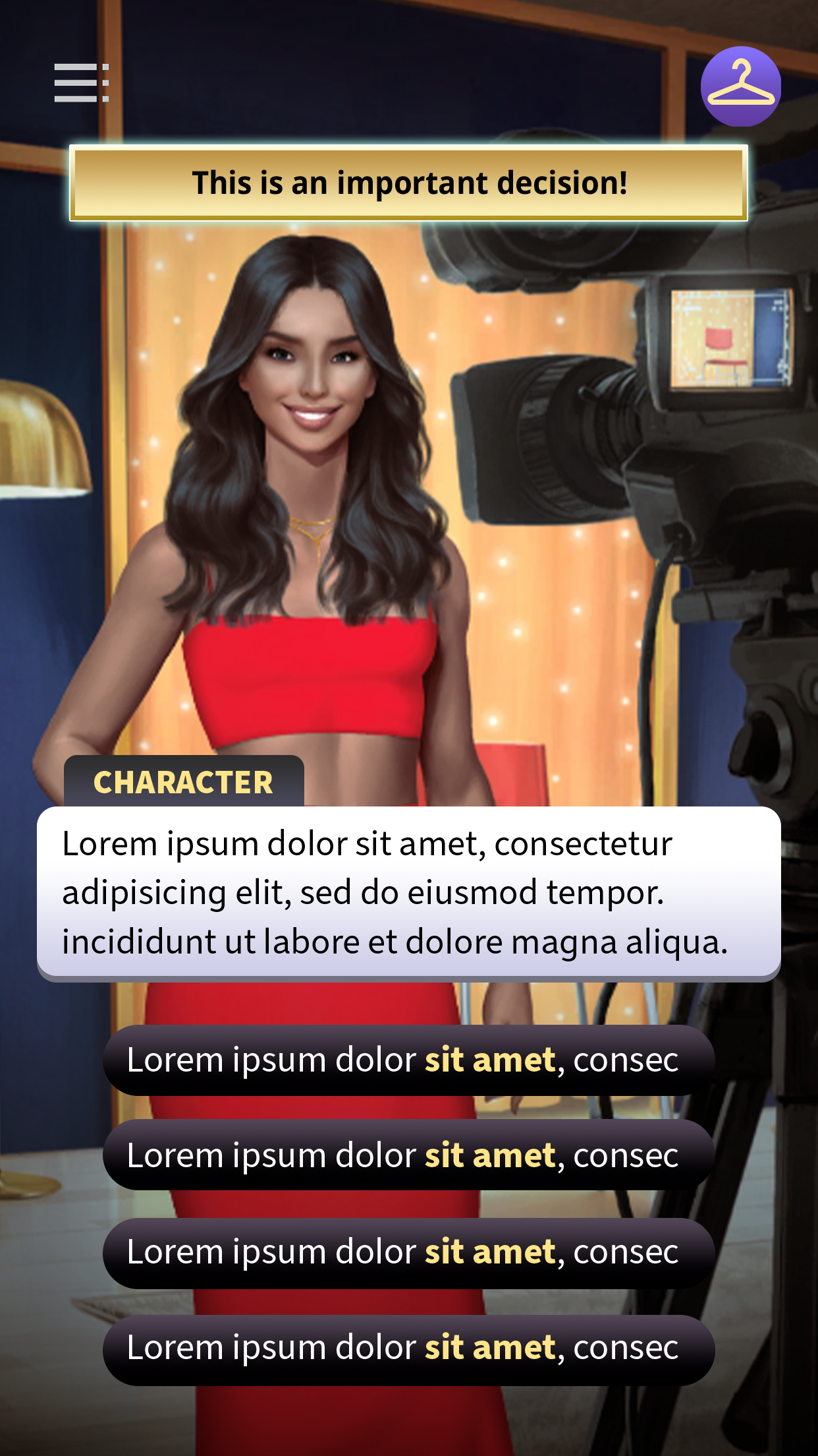
I designed the Dialogue UI
Like the Character Creator, the Dialogue UI was originally intended for Netflix Stories’ debut title, Love is Blind. This design became the foundational template for the entire hub, with each subsequent story using the same core structure.
Objective
To create a Dialogue UI that could scale across all hub games, ensuring accessibility per WCAG guidelines and minimizing visual fatigue for players during extended reading. The dialogue UI should visually distinguish between spoken dialogue, choice buttons, critical choices, narrative text, internal thoughts, and scene changes.
Design Process
I conducted extensive research on graphic novels, manga, and competitor interactive fiction games to understand how dialogue presentation affects readability and engagement. From this research, I identified that the most effective speech bubbles relied on distinct shape language, which I then applied to differentiate spoken dialogue, narrative text, internal thoughts, and choice options.
Next, I explored color palettes with a focus on reducing eye strain and adhering to WCAG accessibility guidelines. Bright white backgrounds caused fatigue on backlit screens, so I prioritized soft, neutral colors with appropriate contrast to ensure long-term readability without clashing with the colorful background art.
To optimize user interaction, dialogue was centered on the screen, keeping the user’s natural focal point in mind. Interactive buttons were anchored in the lower half of the screen for easier tapping, while critical choices were distributed across the screen and paired with images to visually signal their importance. This layout allowed players to scan options thoughtfully and make deliberate decisions.
Through iterative testing and collaboration with stakeholders, this approach resulted in a dialogue system that is visually clear, accessible, and immersive, enhancing player engagement and supporting the overall storytelling experience.
Final Design
After extensive iteration, collaboration, and user testing, I determined the optimal shape and color combinations for the dialogue UI. Soft gradients added depth to the elements and reduced eye strain, making long reading sessions more comfortable. The design also clearly distinguished tappable buttons from non-interactive elements, improving usability.
The dialogue UI was so successful that the team adopted this design as the standard template for all subsequent Netflix Stories games.
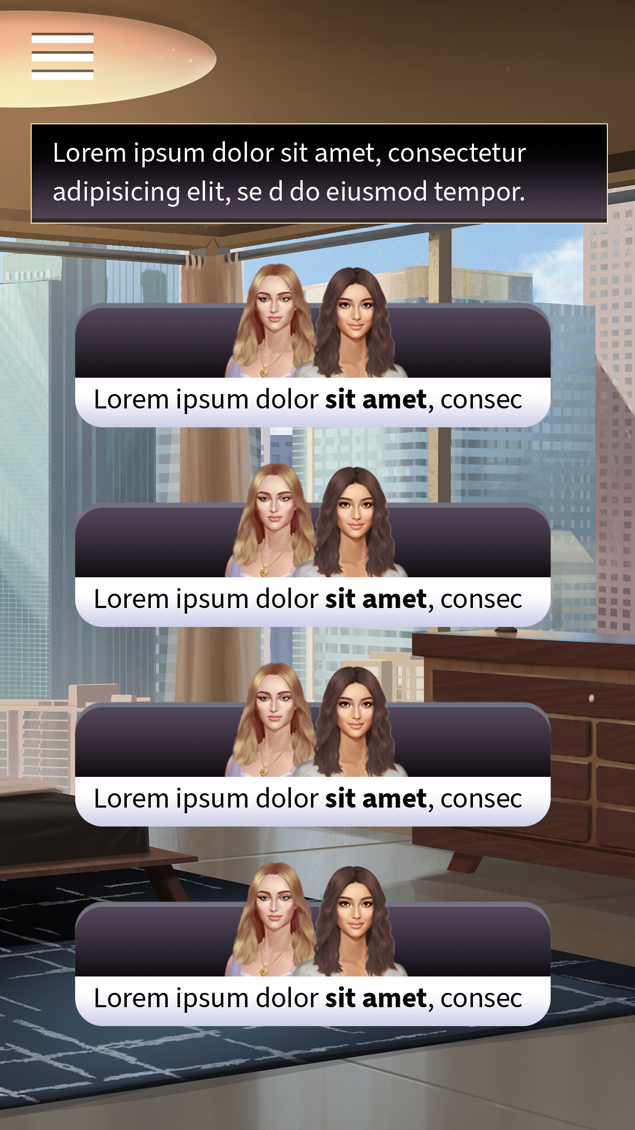
Speech with Choices
Internal Thoughts with Choices
Critical Choice with Prompt
Important Alert

Narration
Scene Change
I designed the Character Profile Screens for Netflix Stories’
Money Heist: Ultimate Choice.
This system was designed as a standalone experience, as this title was the only Netflix Stories game not integrated into the central Hub.
Objective
The goal was to create a character profile experience that lets players select any character and dive into their biography, gameplay notes, and an unlockable image gallery, while fully capturing the look and feel of Money Heist.
Design Restrictions
Money Heist theme colors (red and green) conflict with WCAG and Netflix Accessibility guidelines
Design Process
As a standalone title outside the central Hub, the game required bespoke systems and UI, with a graphic-novel-inspired art direction that matched the series’ high-energy tone. I started by experimenting with different layouts and color combinations.
Final Design
To present dense information without overwhelming players, I designed a layouts using both carousel scroll functions that improved content discoverability while reducing cognitive load. High-contrast color choices were applied to meet accessibility standards and support color-blind users, ensuring key red and green UI elements remained clearly distinguishable and legible across all screens. The final layout was tested against multiple types of color blindness to validate accessibility.
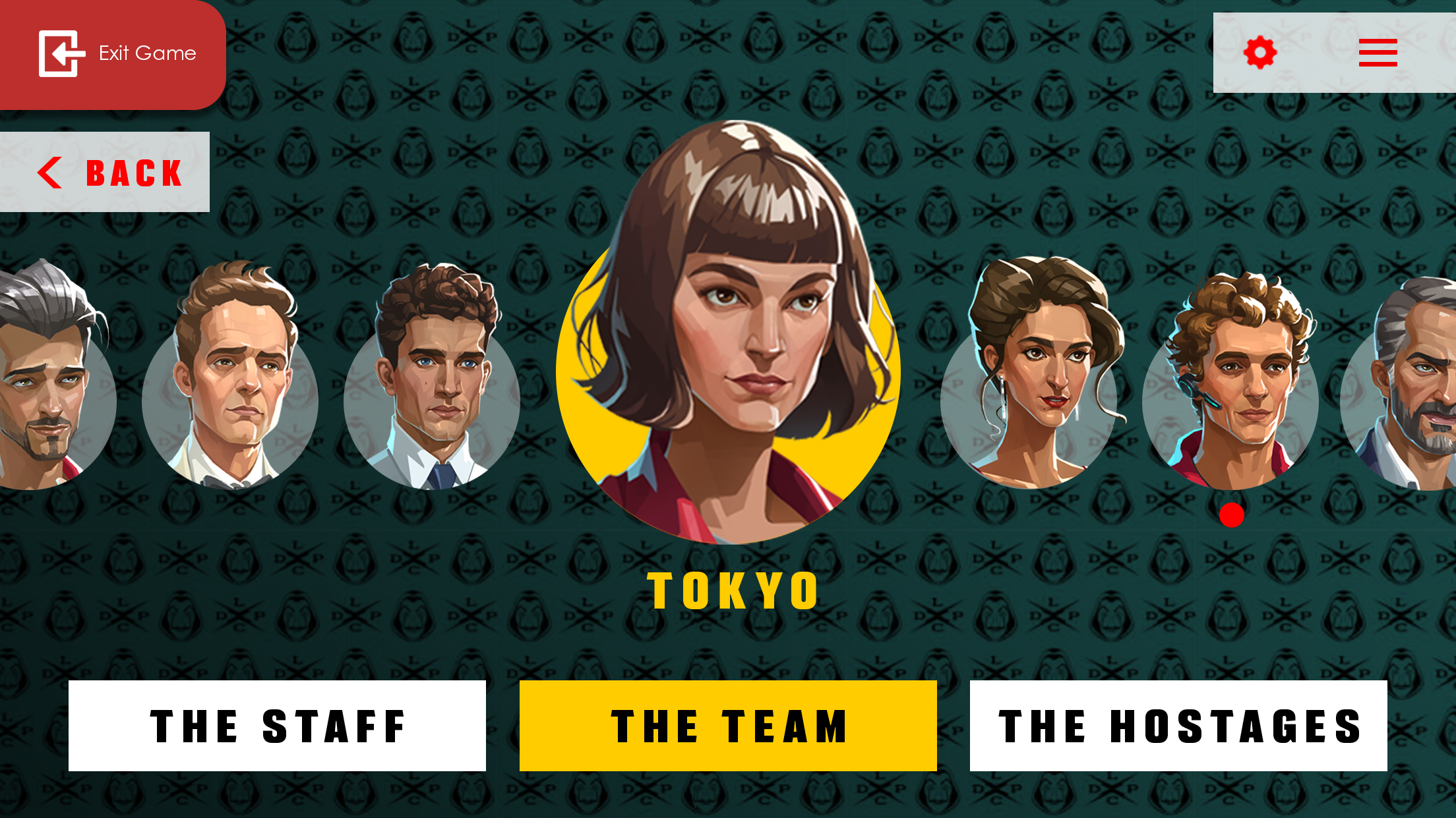
Character Selection
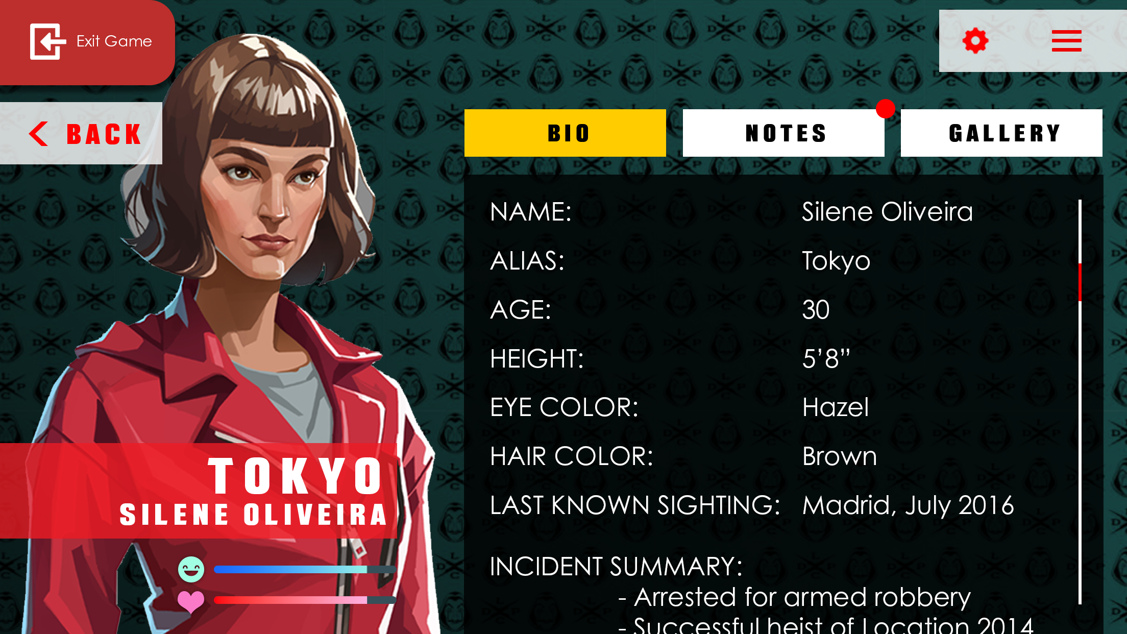
Character Bio
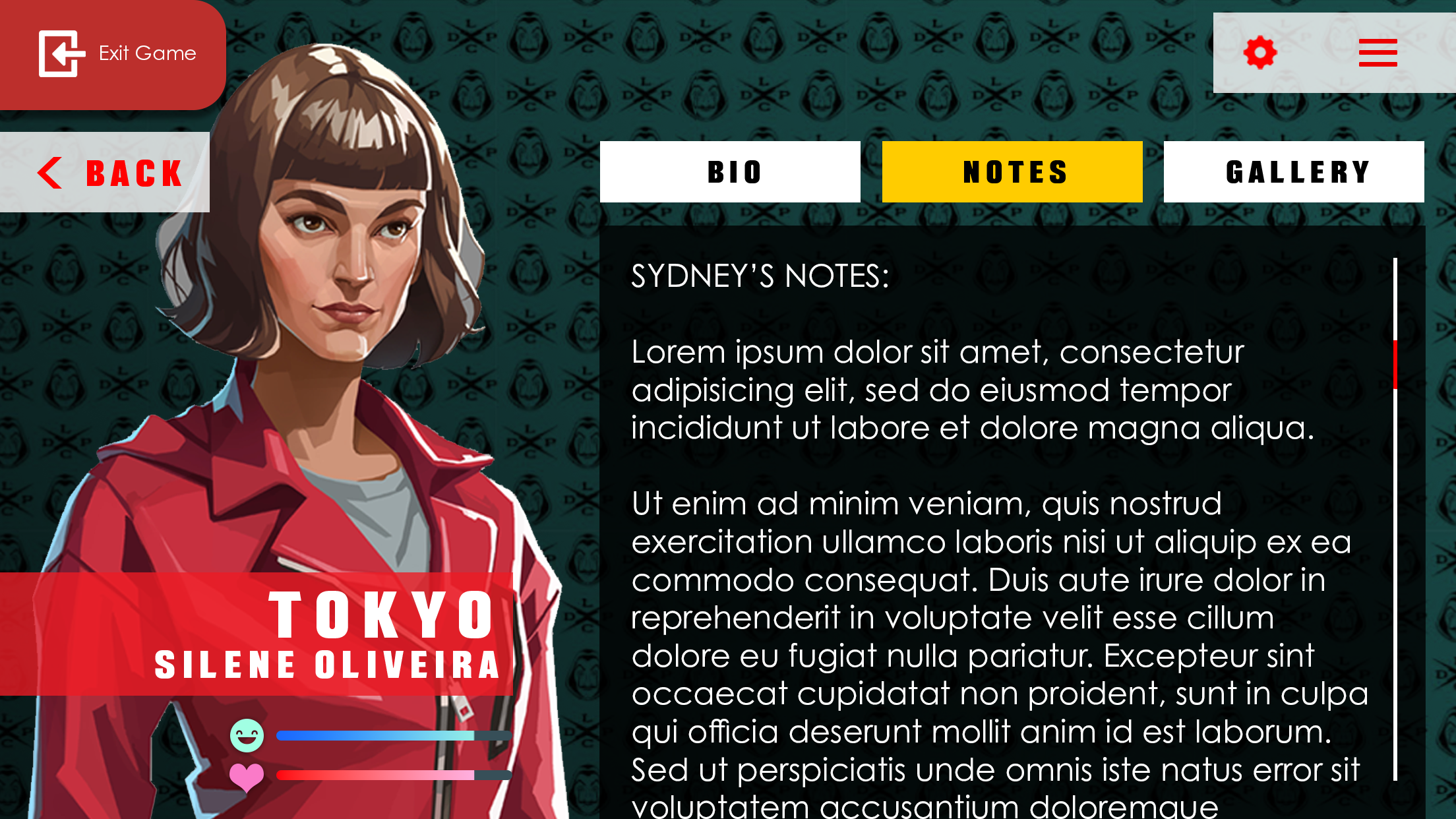
Character Notes
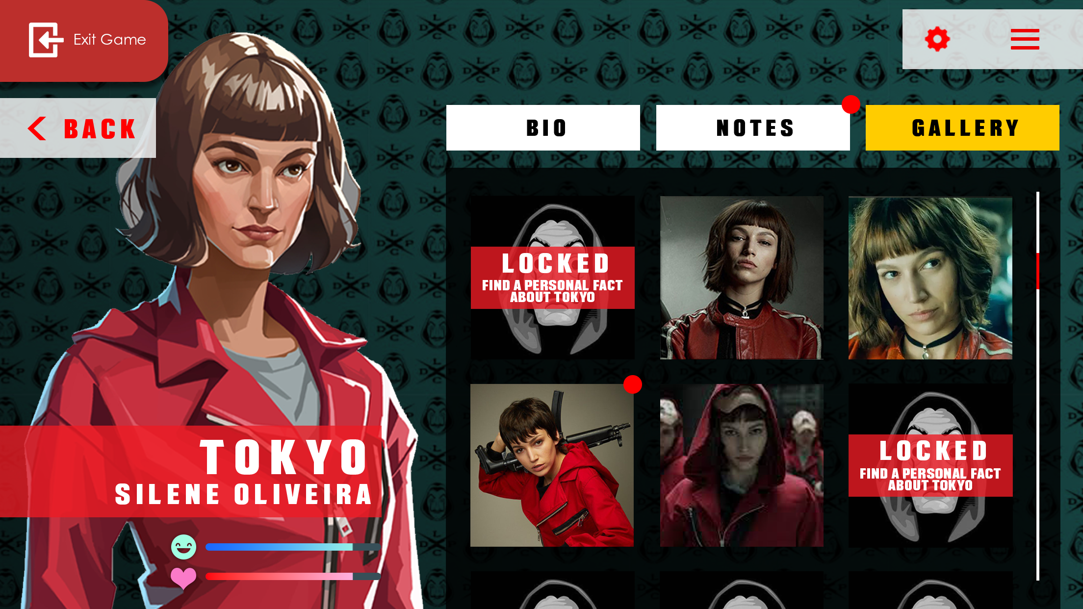
Character Unlockable Gallery
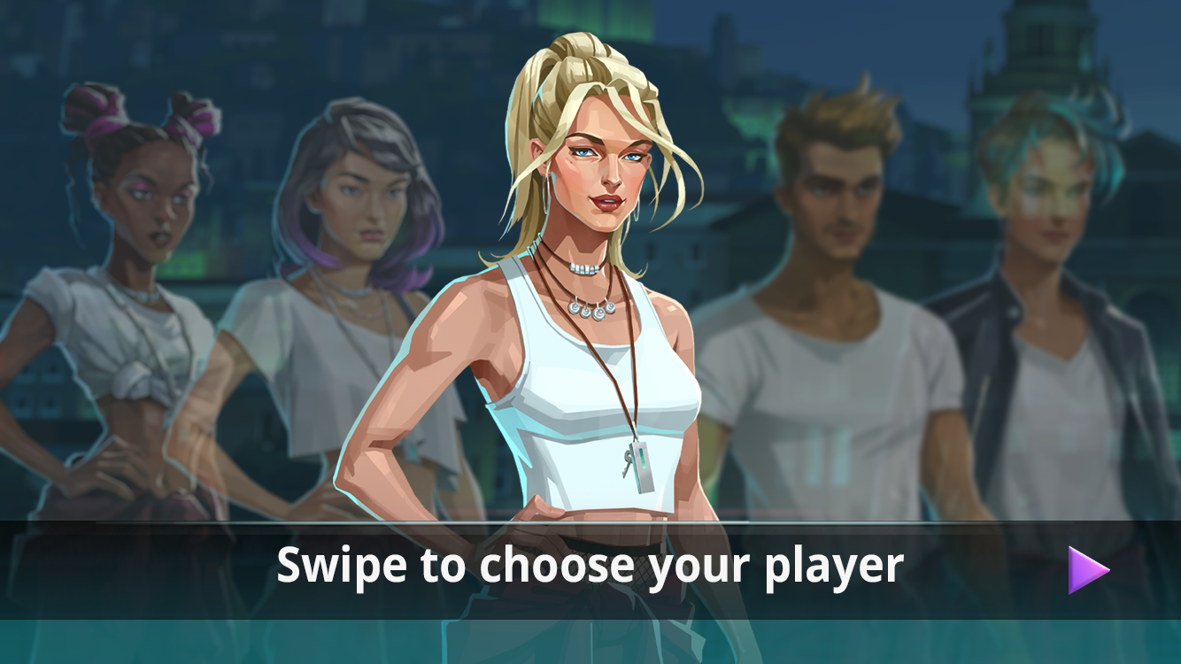
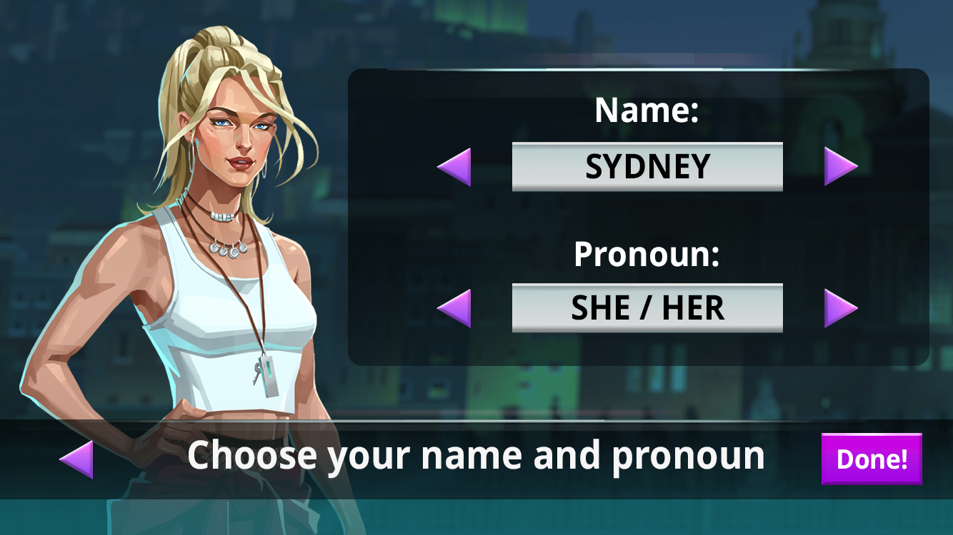
I designed the Character Selection Screen for Netflix Stories’
Money Heist: Ultimate Choice
This system was designed as a standalone experience, as this title was the only Netflix Stories game not integrated into the central Hub.
Objective
To design a landscape-oriented character selection screen that displays all available characters at once, allowing players to choose a character, select a custom name, and select a pronoun.
Final Design
I implemented a carousel-based selection system that prioritizes the center character as the active state, using depth, opacity, and blur to visually de-emphasize non-selected characters while keeping them visible. Name and pronoun selection are handled through left and right cycling controls, allowing users to quickly iterate through options without leaving the screen.