Ingress Prime
Ingress Prime is a location-based augmented reality mobile game where players choose one of two factions—the Enlightened or the Resistance—and compete for control of real-world locations called portals. Using their phone’s GPS, players physically move through the real world to capture portals, link them together, and create control fields to earn points for their faction. The game combines exploration, strategy, and teamwork, emphasizing real-world movement and large-scale, faction-based competition.
The official trailer for Ingress: Prime
ROLE
UI/UX Designer
(The only one in the entire team)
Company
Niantic, Inc.
Background
Ingress has a cult following with a highly passionate player base. The original game was succeeded by Ingress Prime, with most players migrating from the original title and new players primarily discovering the game through word of mouth. Despite this, Ingress Prime received significant negative feedback around its UI/UX, which led to player drop-off over time. The UI/UX has remained largely unchanged since launch, and while the game still maintains a sizable active player base, overall performance has gradually declined.
I joined the team in the game’s eighth year, during the height of the COVID-19 pandemic when many regions were under quarantine. This posed a major challenge, as the game is heavily dependent on real-world travel and social interaction. The team needed to identify new ways to sustain player engagement and stabilize revenue with limited movement and in-person play. At the same time, the company was developing new AR capabilities that needed to be thoughtfully integrated into the game experience.
Niantic leverages player-submitted portal scans in Ingress to create detailed 3D models of real-world locations, effectively crowdsourcing valuable geospatial data. These scans enhance the AR capabilities of their games, making features like PokéStops, gyms, and AR interactions in Pokémon Go more immersive and accurate. The data also powers Niantic’s Lightship ARDK, their augmented reality development kit, enabling other developers to build AR experiences using the rich, real-world mapping and localization information collected from players. By turning players into data collectors, Niantic boosts the long-term value of its games and AR platform, strengthens player engagement, and creates opportunities for licensing its technology to external developers.
Key Objectives
Our key objectives were to increase daily active users (DAU), improve player retention, drive revenue growth, and attract new players, while introducing new AR technologies and gathering player feedback.
Technical Constraints and Design Restrictions
There were several key challenges that needed to be addressed. The UI/UX was confusing, making it difficult for new players to understand core mechanics without guidance from experienced players. Many icons lacked clarity, and the interface relied heavily on hidden touch gestures that most players were unaware of. At the same time, the game had a long-standing player base of over eight years who were resistant to change, resulting in significant pushback on any updates and unintentionally gatekeeping the experience from new players. Additionally, the AR technology was not yet fully stable, as Niantic intended to test and refine these features in Ingress before rolling them out to Pokémon GO.
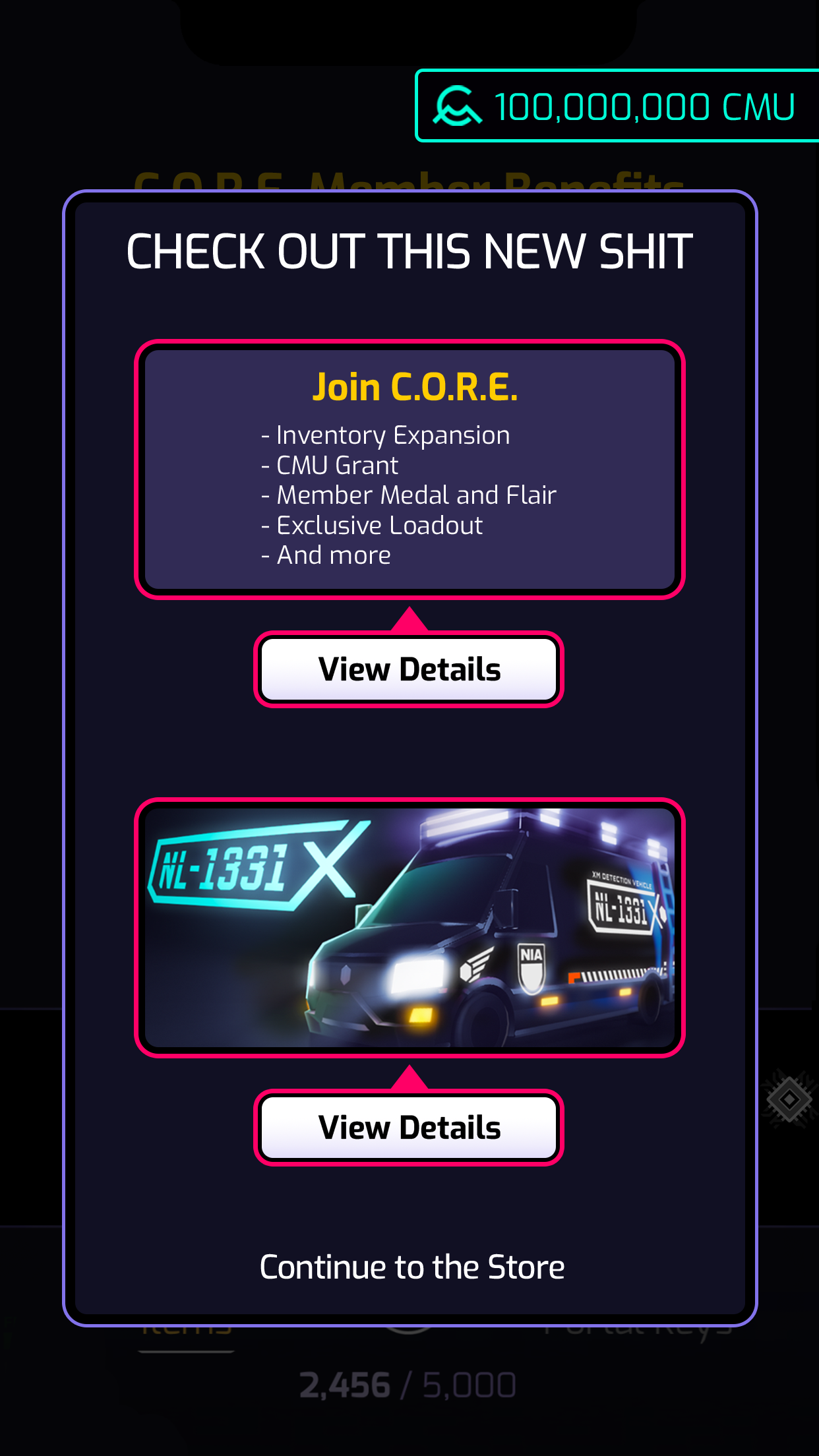
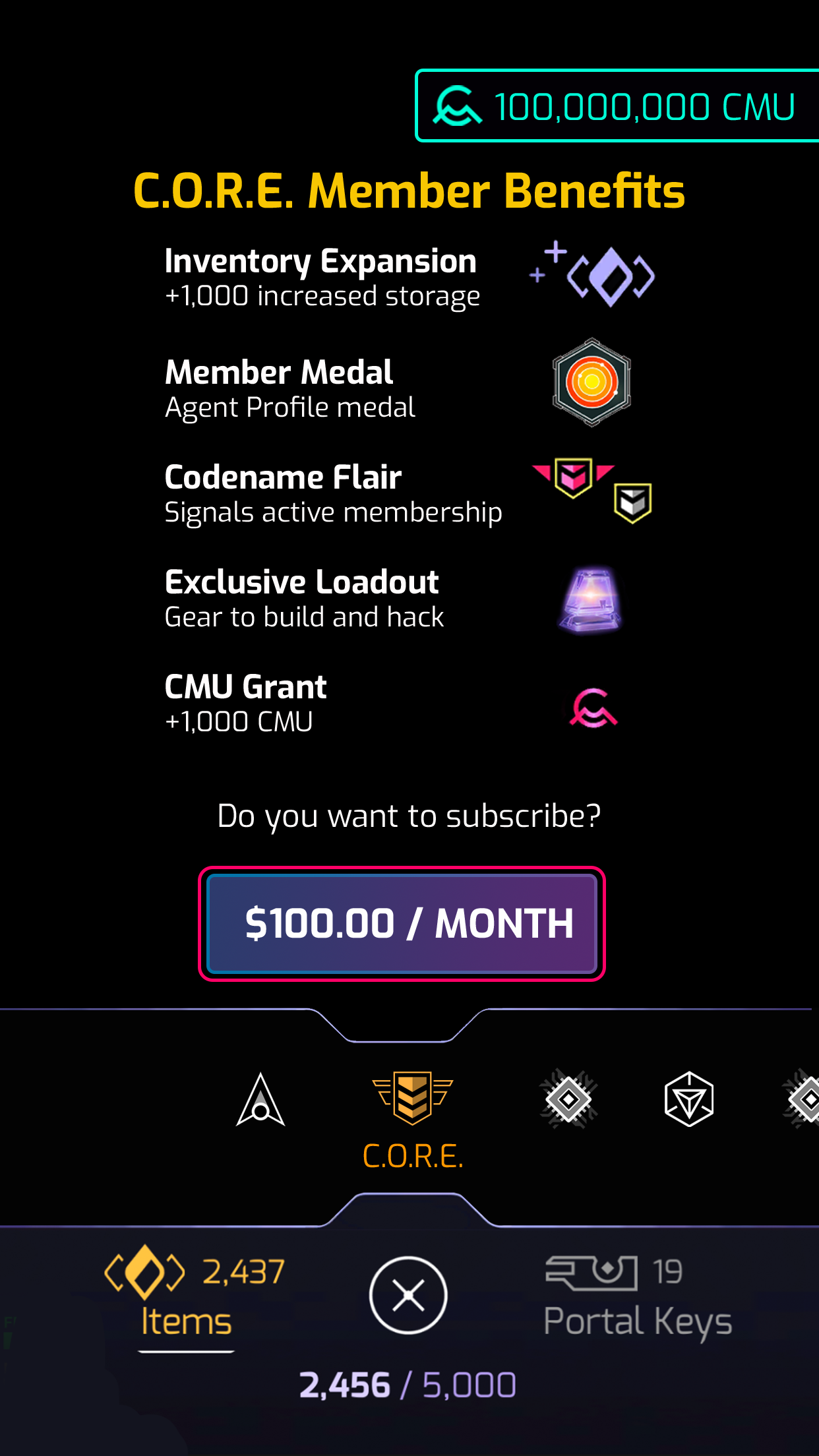
I redesigned the Store
The store in Ingress lets players purchase optional items and upgrades that enhance gameplay and support progression, serving as a key monetization feature.
Objective
The objective is to encourage players to purchase more items by redesigning the store to be more user-friendly and by highlighting key items.
Design Process
I began by identifying user pain points and found that the existing store design was confusing, counterintuitive, and did not effectively highlight special sales or featured items.
Several issues were negatively impacting the player experience. Players could not easily see how many items were included in a bundle, the text color system was misleading with the wallet balance displayed in red (causing players to think they lacked sufficient currency) and the overall organization made it difficult to navigate between item categories. Additionally, it was hard for players to tell which items they already owned and could equip.
I then collaborated closely with product and engineering to iterate on the wireframes, spending significant time discussing the hierarchy and prioritization of purchasable items. We determined that the CORE Subscription should take the highest priority in the store, as subscriptions account for the majority of the product’s steady revenue. We also wanted players to easily see ongoing seasonal sales to build excitement, and maximize engagement around special holidays and events.
After several rounds of discussion and refinement, we aligned as a team that this layout and flow were the best approach for updating the store.
Recognizing that players often ignore pop-ups, I prioritized the store landing page, directing players first to the CORE Subscription page. Seasonal sales were featured in pop-ups, aligning with player expectations for special offers.
I designed the store with a hybrid carousel-scroll layout, allowing players to easily swipe through different categories and view items. This layout makes navigation intuitive and reduces mental effort, leveraging gestures that players are already familiar with from other parts of the game.
Each tile now displays all the information a player needs before making a purchase, including the item name, image, quantity (for bundles), and price. Additionally, the player’s wallet was changed to green, giving the impression that they are “in the green” and have sufficient currency to make purchases.
Once the wireframes and flows were finalized, I created the new UI assets for the updated tiles, with no additional color exploration needed since the store already existed.
Final Design
Map
Main Menu
Pop Up featuring seasonal sales
Store Landing - CORE Subscription
Swiping Bottom Carousel to move between Categories
Item Details
Item if Player already owns and can equip
Item unable to purchase
Temporary Boosts Page

Boosts Details

Boost Purchase Confirmation
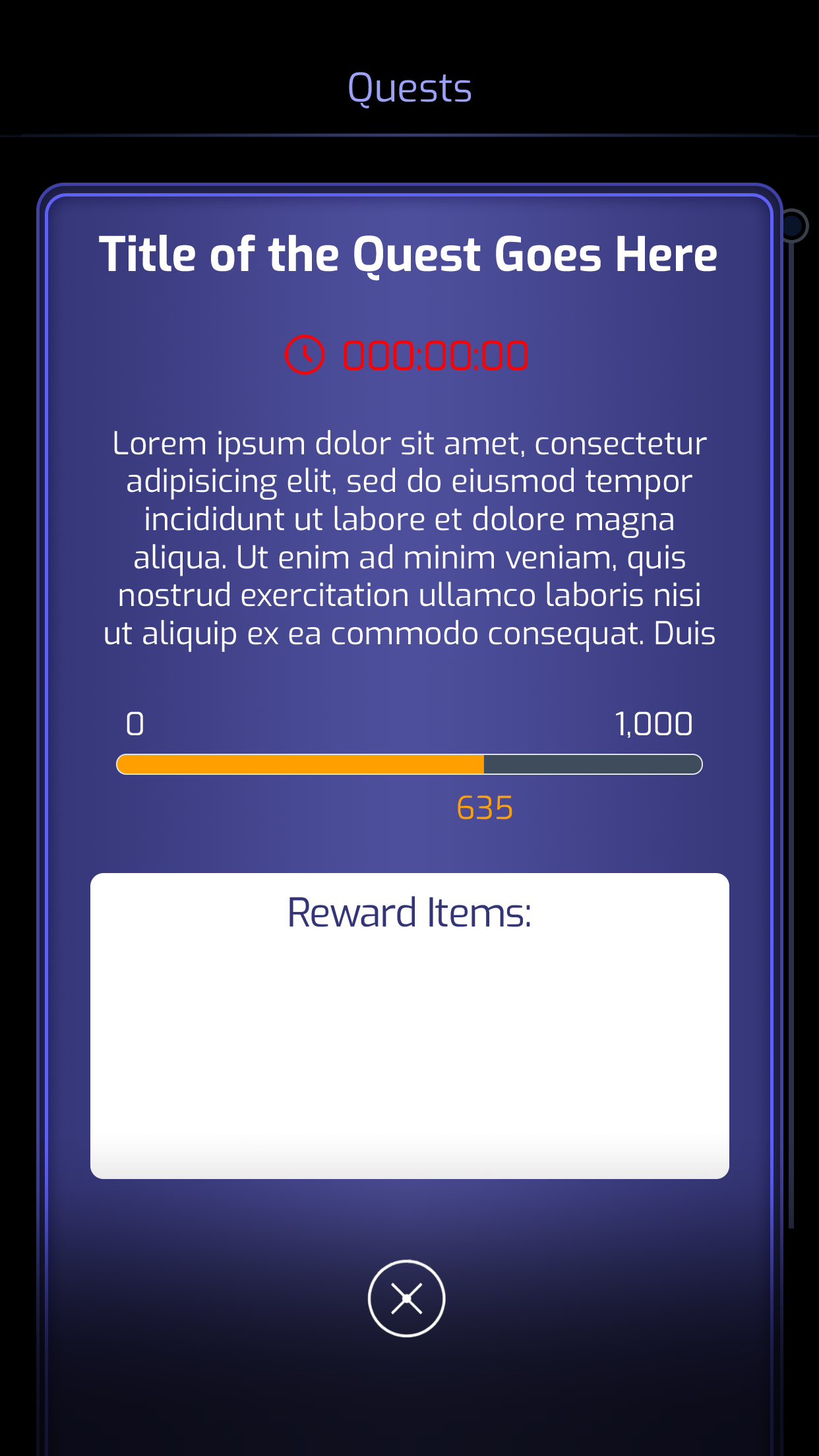
I designed the Quest System
It is a system that lets players view upcoming and available quests, check quest details, track their progress, and review completed quests.
Objective
To boost player engagement by introducing Quests that incorporate narrative and integrate tutorials into gameplay. Quests also encourage players to use items from their inventory, giving them a reason to make additional purchases from the store.
Design Process
I began by mapping the user journey using several personas and discovered that not all players would be interested in playing Quests. I also needed to create a clear entry point for accessing them.
My solution was to add a persistent floating icon on the main map, making Quests easily accessible and serving as a reminder of their presence. Players can view upcoming and available quests, check quest details, track progress, and review completed quests. Quests are entirely optional, but special rewards are offered to motivate players to participate.
Final Design
Map with Floating Icon
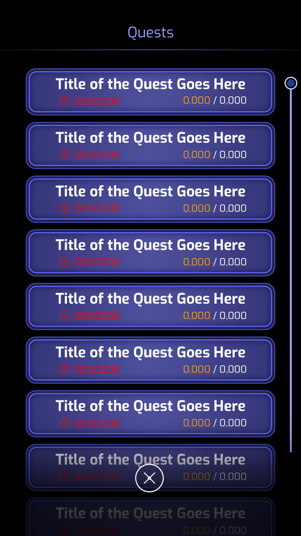
Quest List
Quest Detail
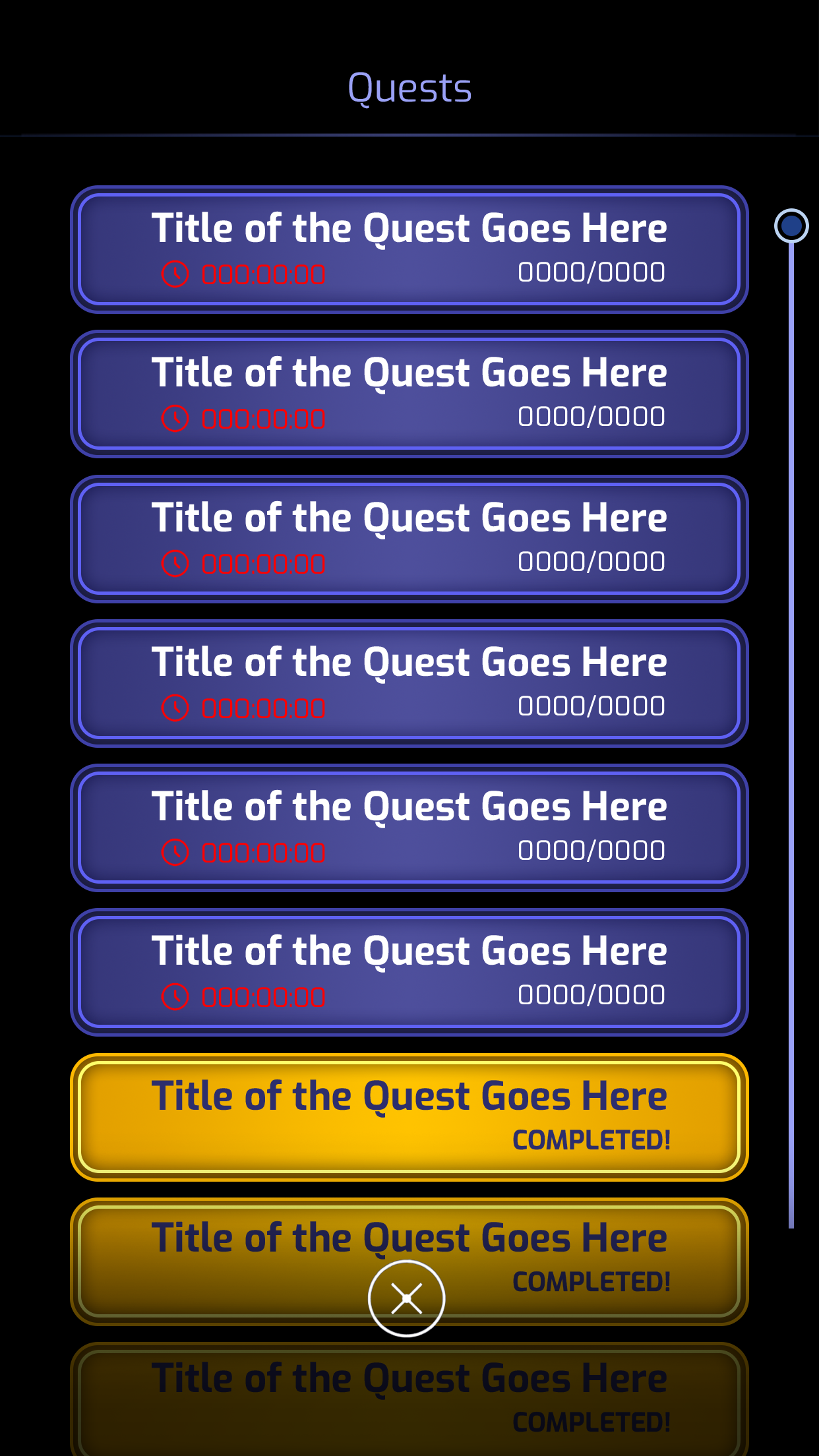
Completed Quests
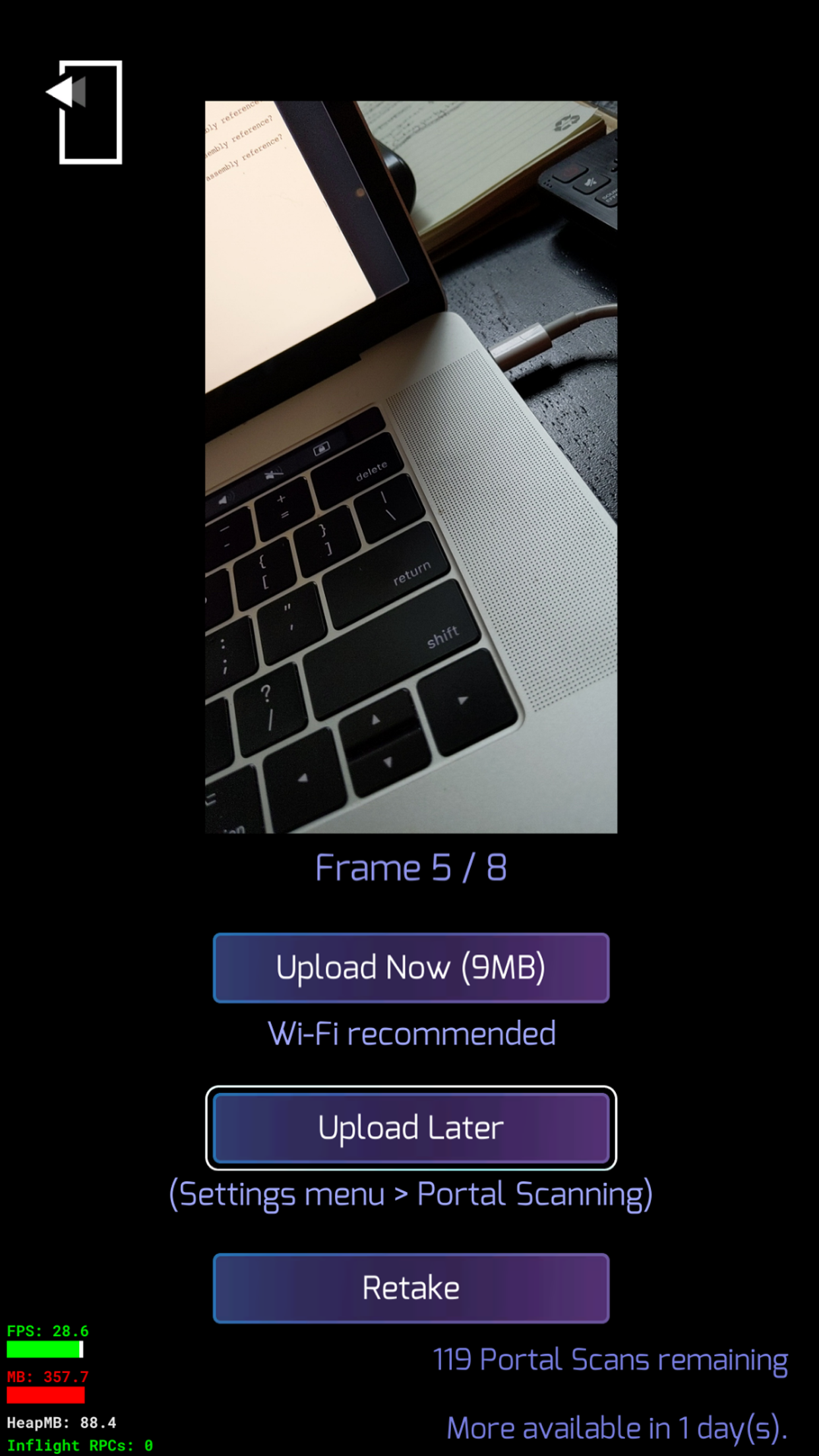
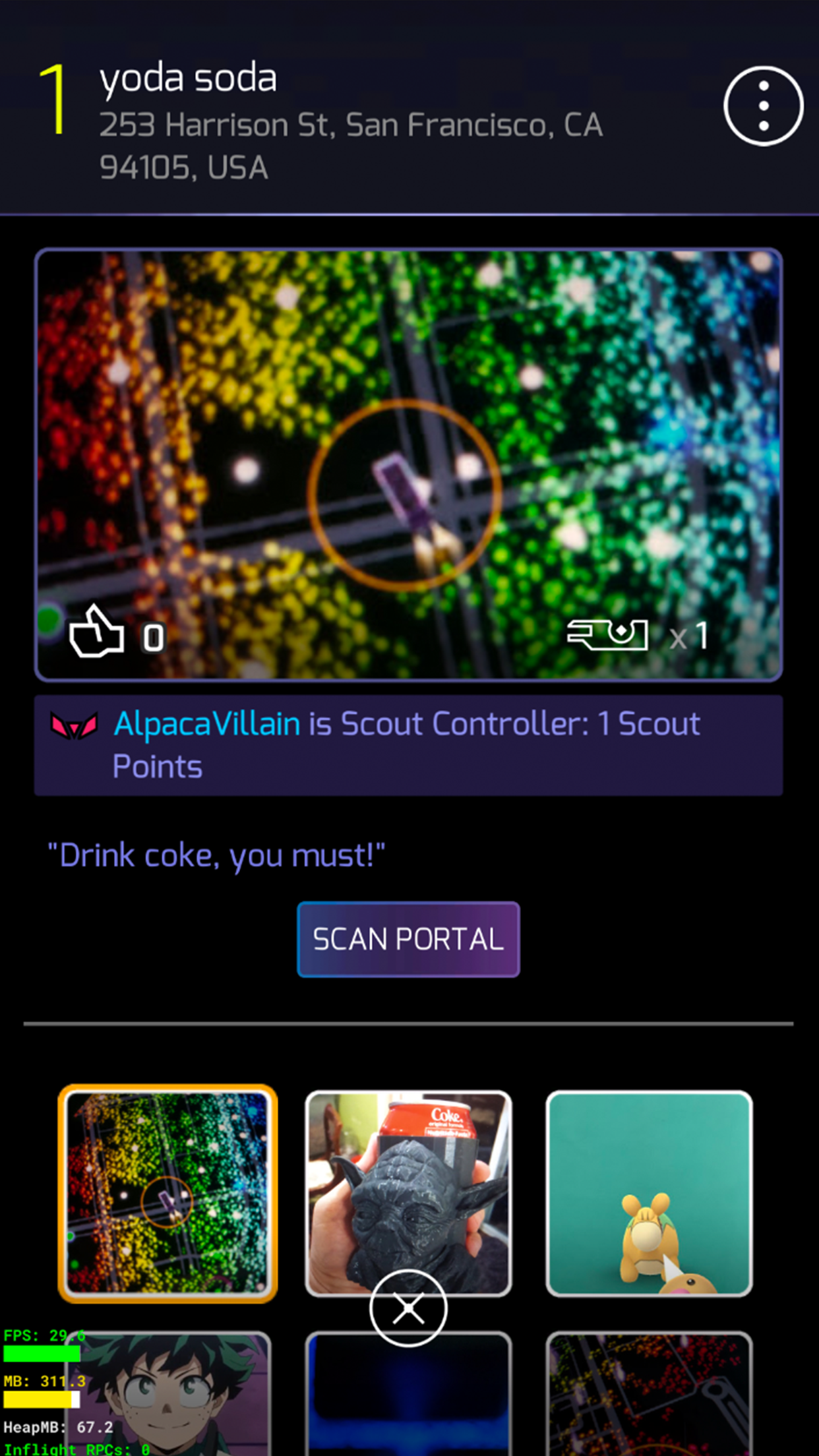
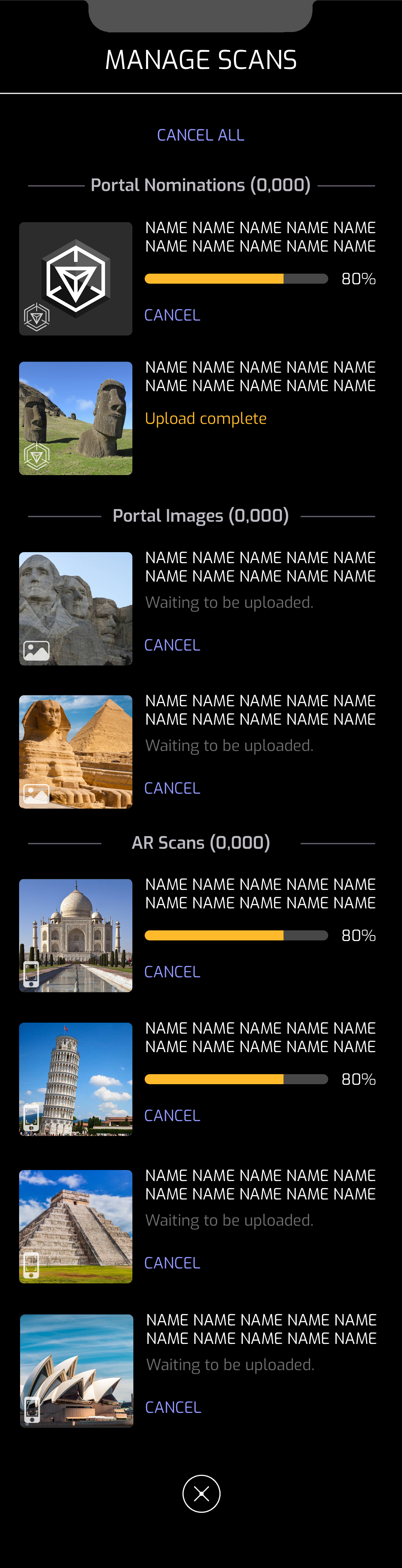
I designed the Scan Upload Management System.
It is a system that allows players to locally store Portal Scans and upload them later when a Wi-Fi connection is available.
Portal scanning in Ingress is a feature where players capture 3D images of real-world portals (various real-world landmarks), creating detailed models of those locations.
Objective
To motivate players to submit more portal scans, since Niantic gains significant value from the free data contributed by its users.
Design Process
I began by researching the user journey to identify pain points players face when uploading portal scans. I discovered that many scans are large files, which can consume significant data if uploaded without Wi-Fi. Additionally, uploading multiple scans is cumbersome, as each scan must be accessed and uploaded individually.
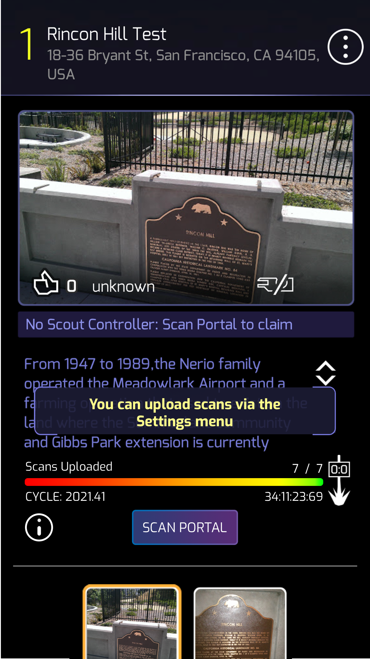
After collaborating with product management and engineers, I proposed a solution: a dedicated section in the settings menu to manage all of a player’s portal scans. This system allows players to choose to upload scans later when connected to Wi-Fi. Players can also opt for a quick upload of all scans at once or enter the management interface to selectively upload or delete specific scans.
Final Design
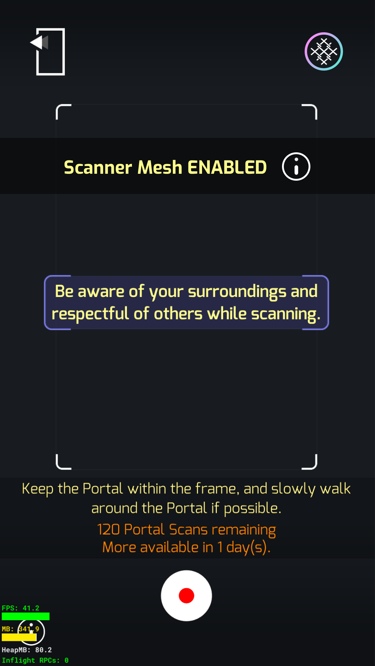
I began by updating the tutorial to make portal scanning clearer and reduce player confusion. Next, I implemented the Scan Management System within the Settings menu, giving players a centralized place to manage their scans. Additionally, I added a Quick Scan option for those who preferred not to navigate the full management system.

Main Map
Portal
Portal Info

Scan On
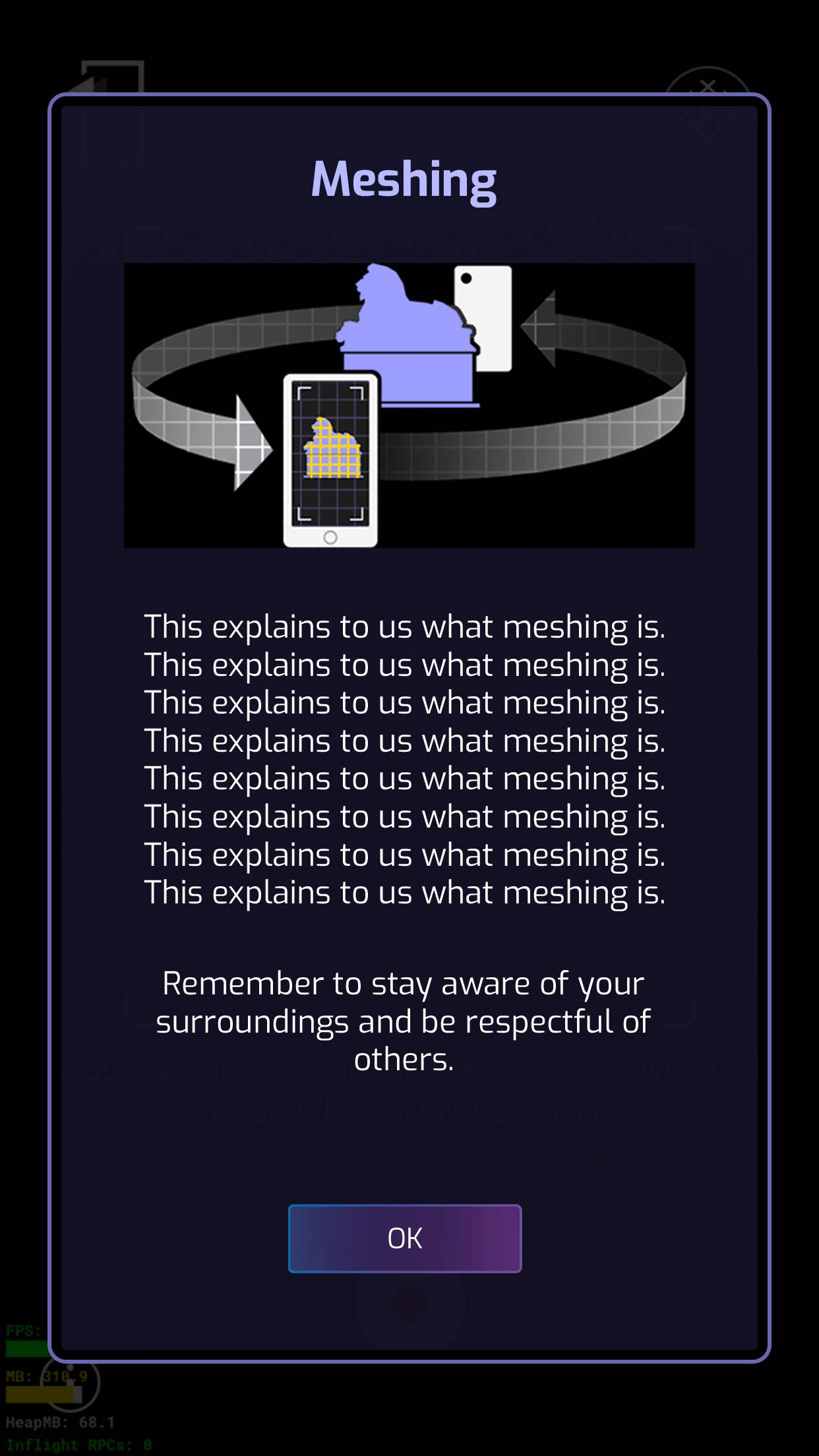
Explanation of Meshing
Main Map
Menu
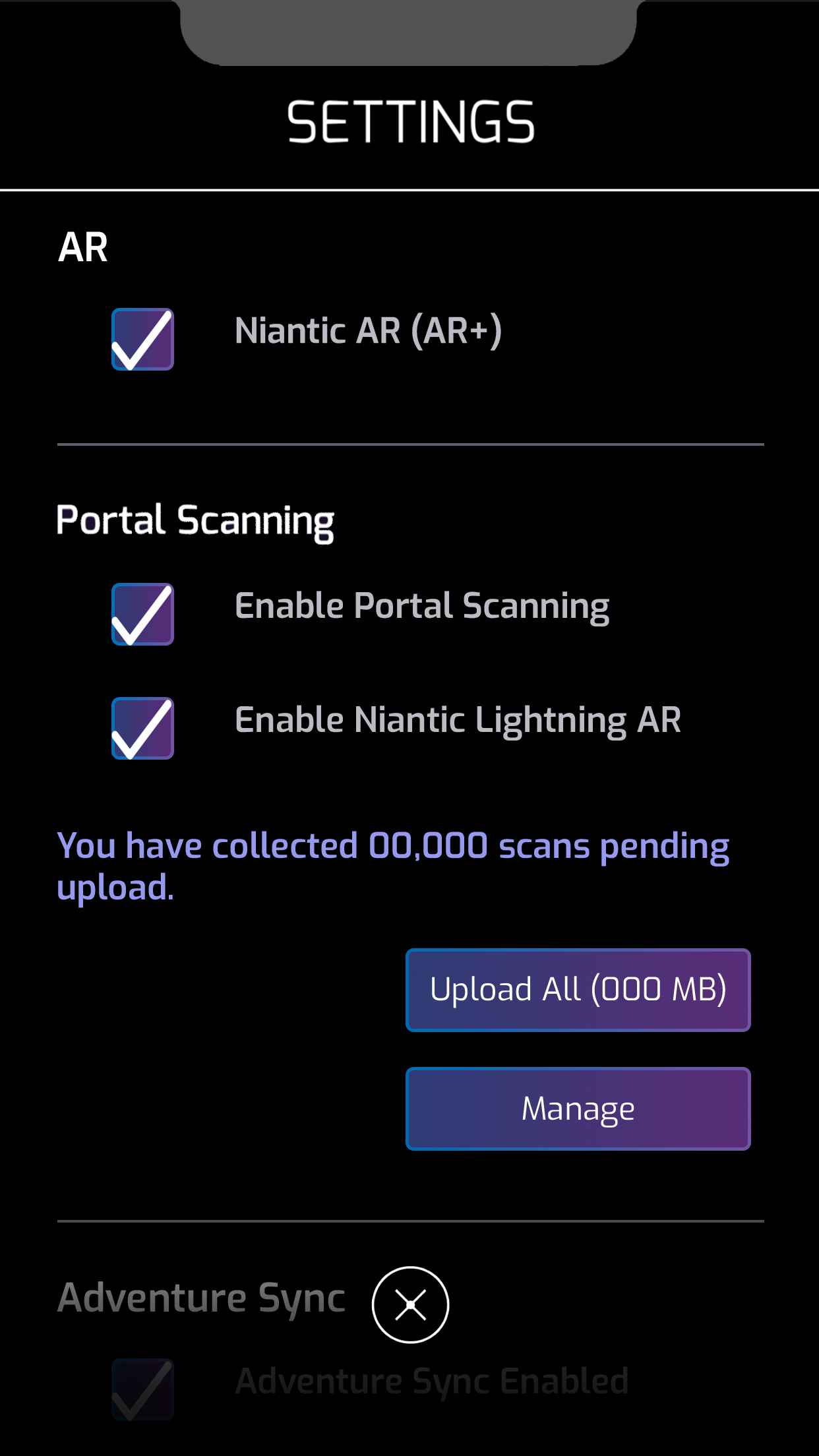
Settings
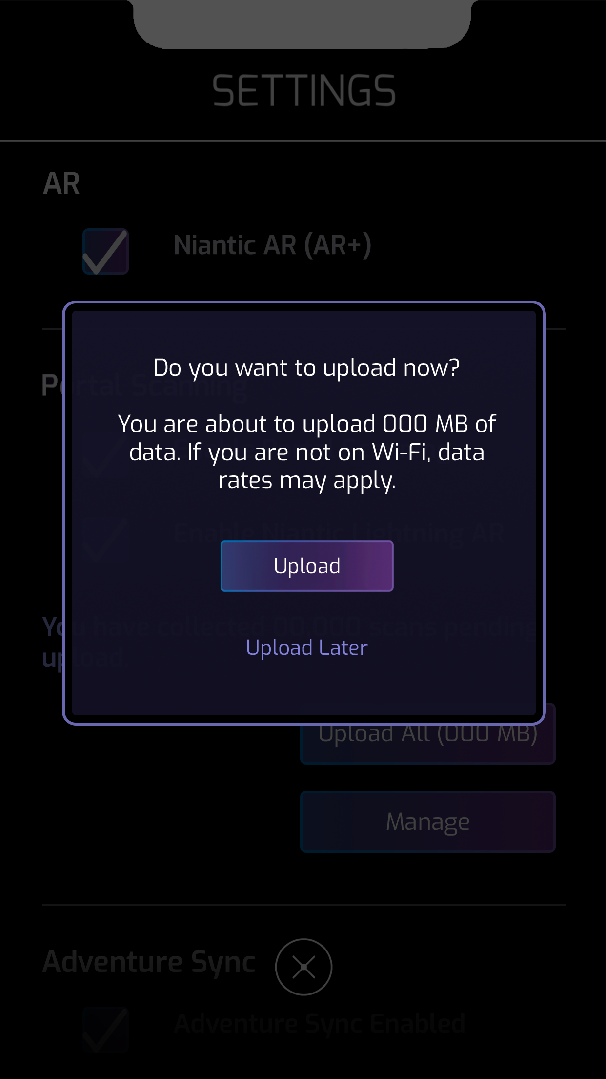
Warning
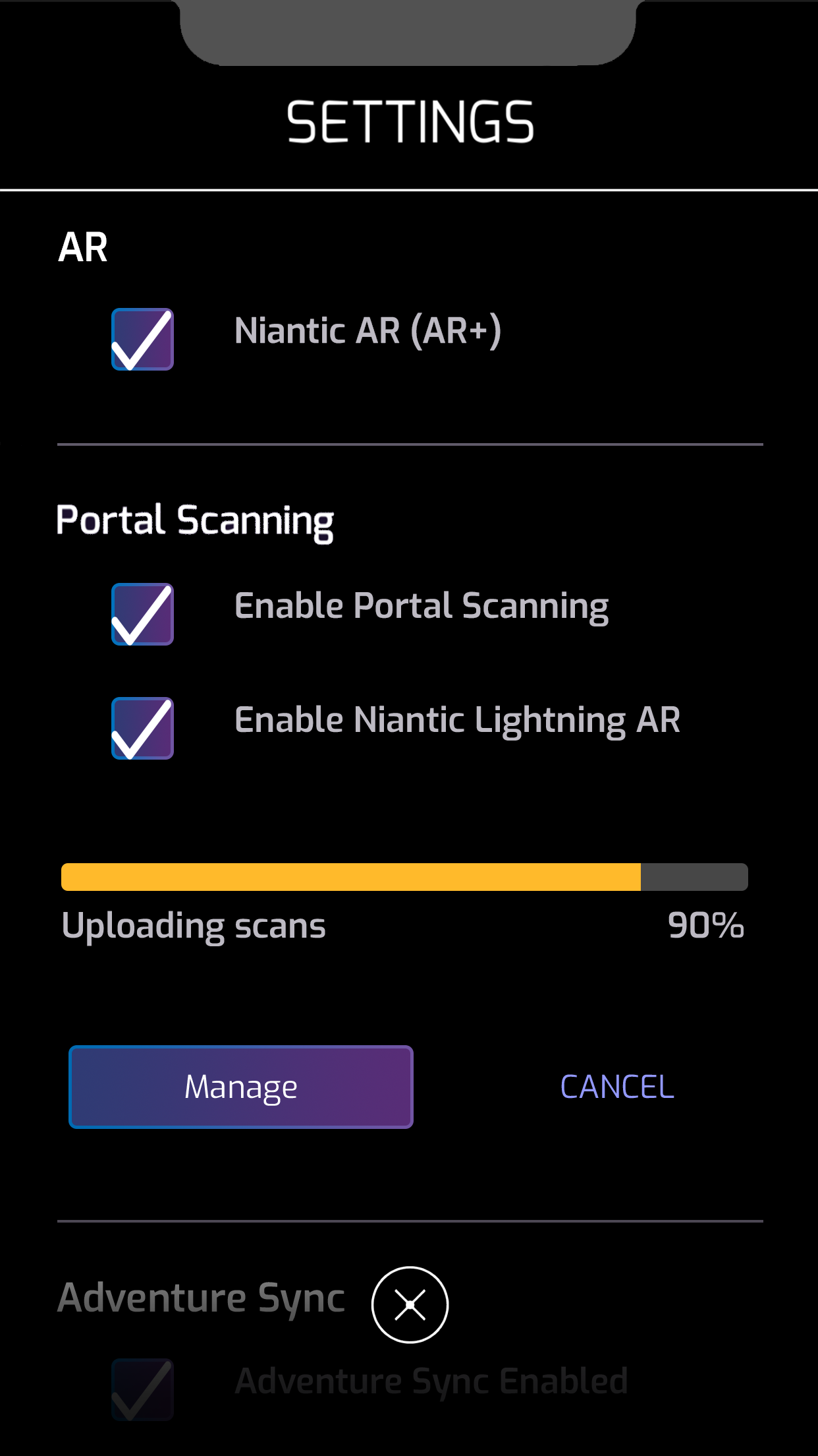
Uploading
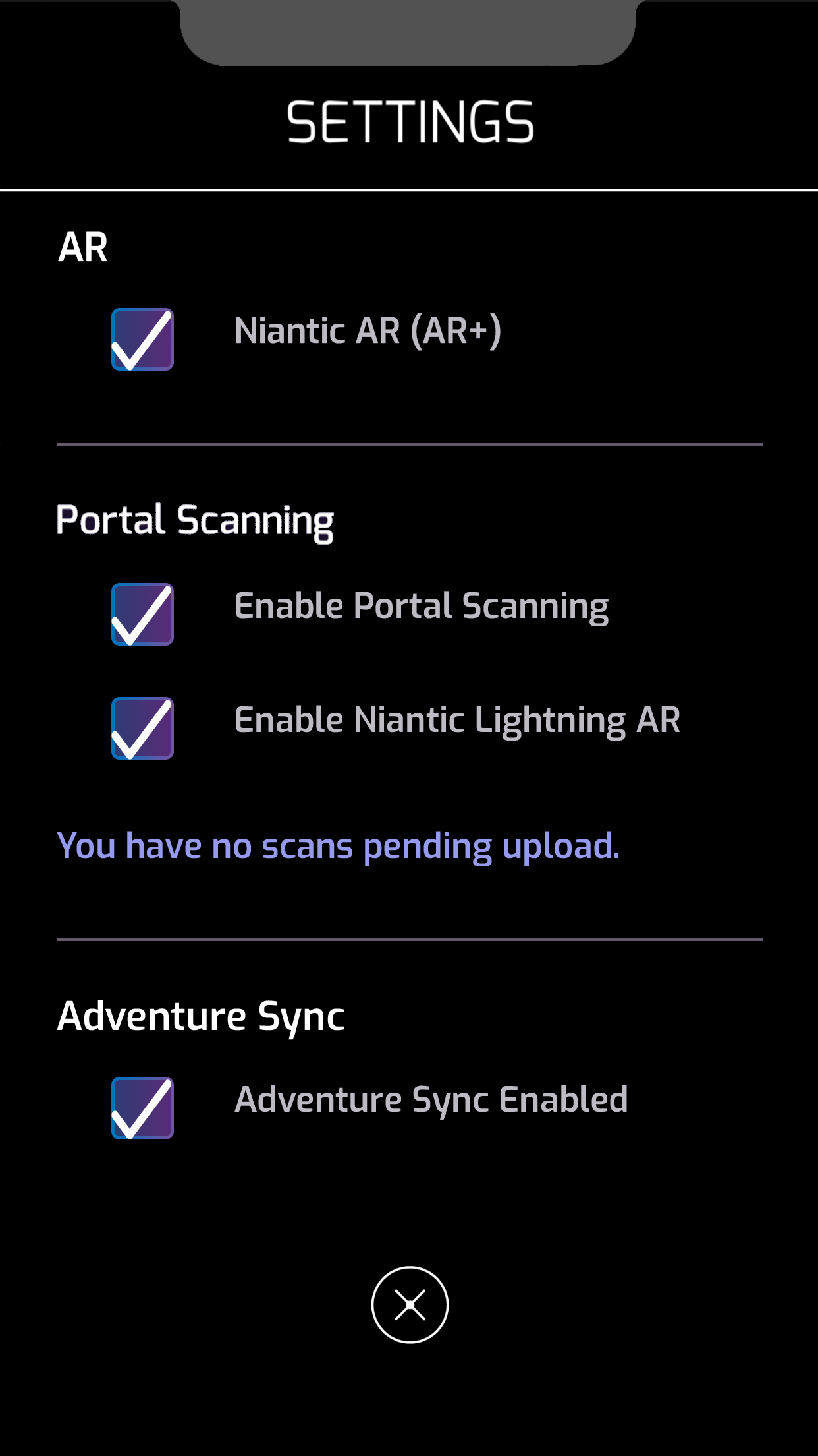
None to Upload
Main Map
Menu
Settings
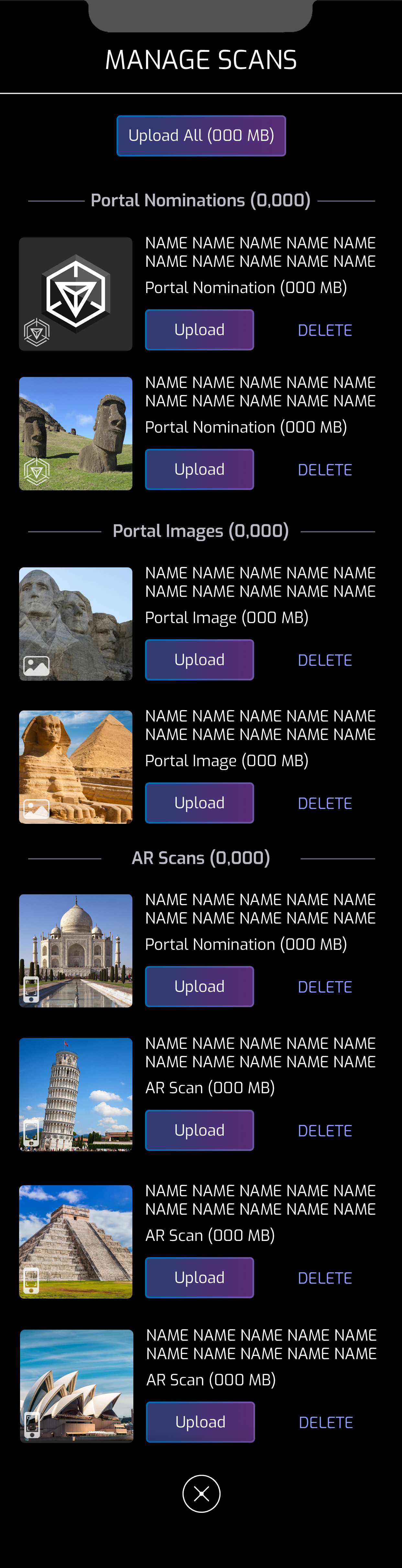
Scans List

Partial Upload
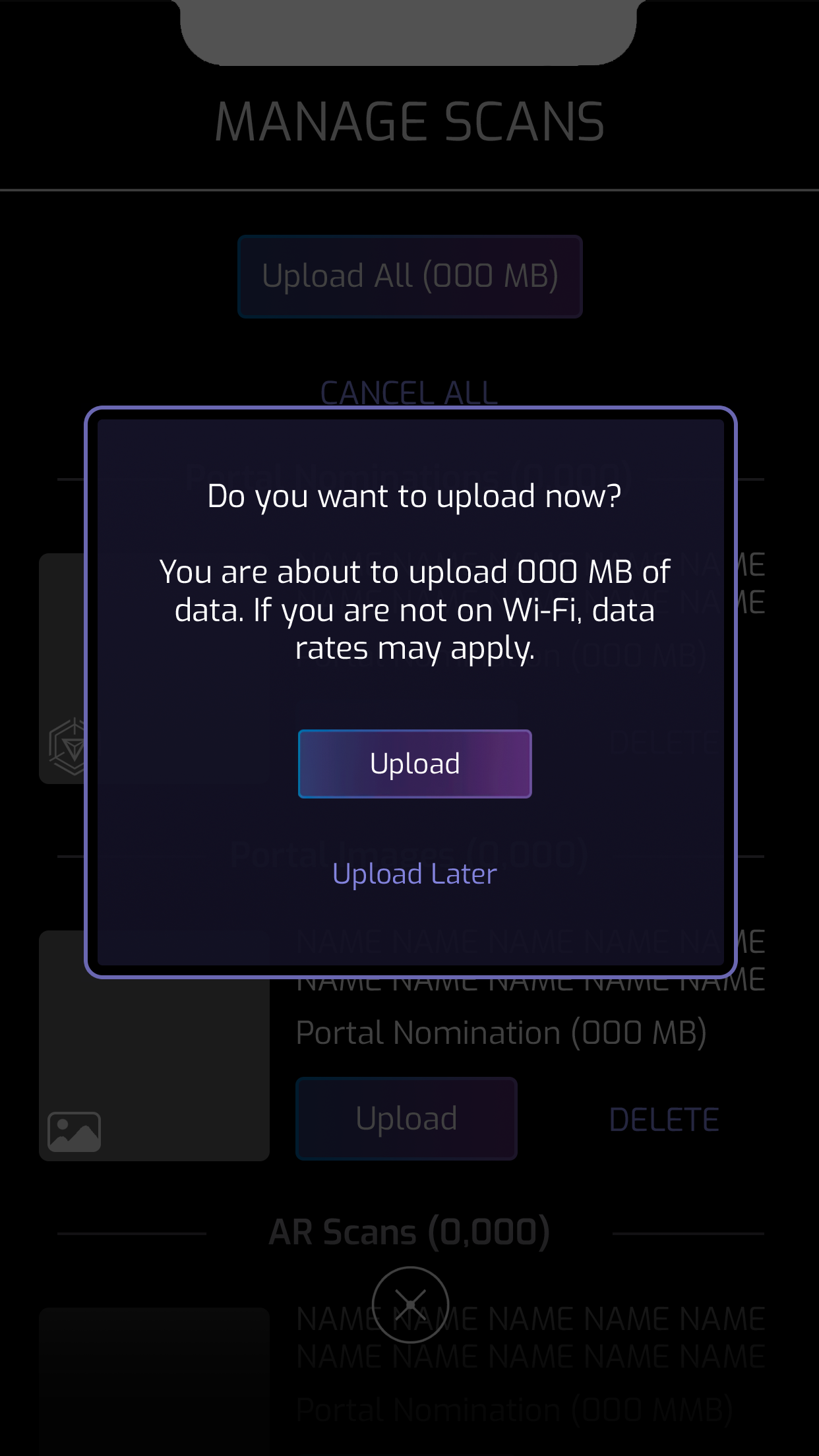
Upload Warning
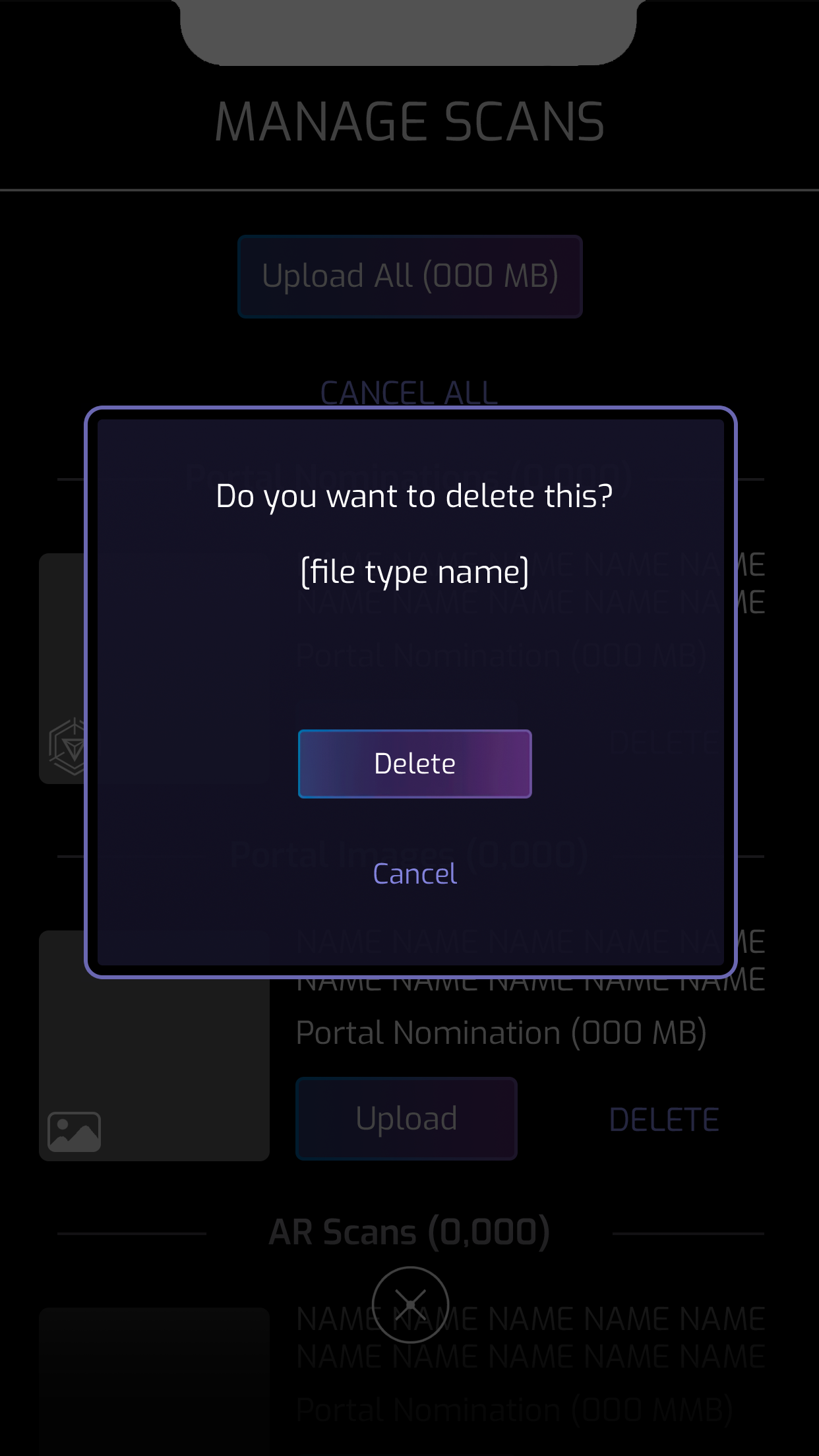
Delete
Upload All
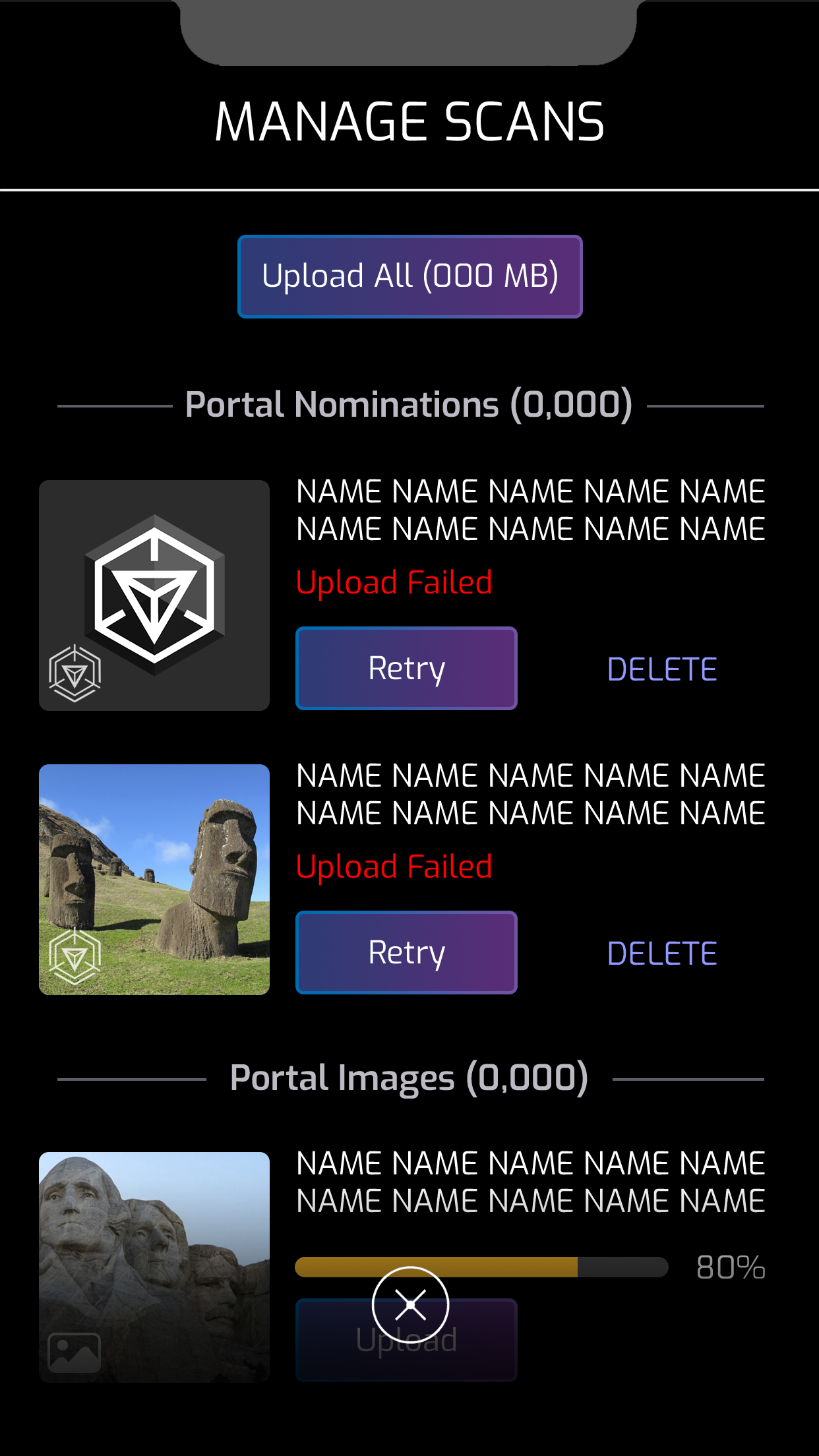
Upload Failed
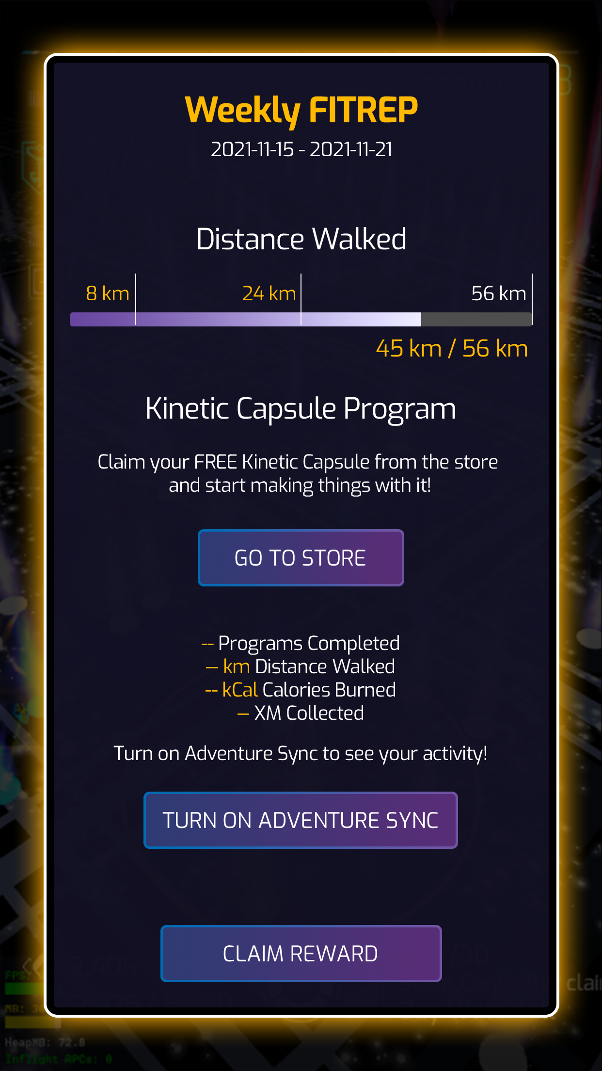
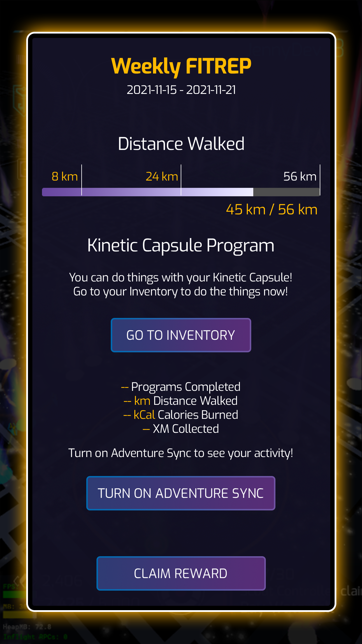
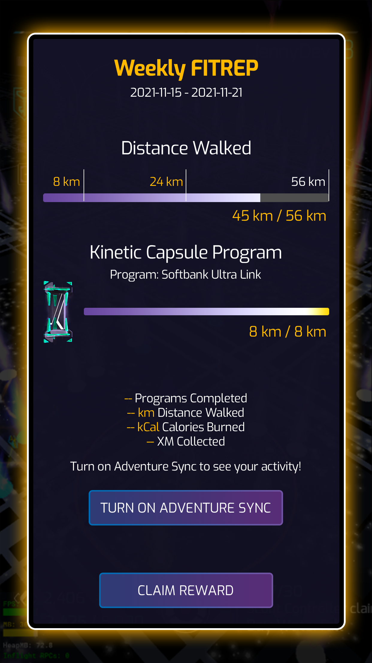
I designed the feature Adventure Sync - Weekly FitREP
A weekly pop up that appears on launch that summarizes the player’s weekly total distance traveled and status of their Kinetic Capsule.
Objective
The objective is to encourage players to enable Adventure Sync and engage with the game outdoors. The COVID-19 pandemic has altered many players’ lifestyles, leading to reduced physical activity and, as a result, less time spent playing Ingress.
Final Design
I designed a popup that displays the player’s weekly total distance traveled and shows how it benefits their kinetic capsule. This both encourages players to get outside and rewards them for walking and engaging with the game.
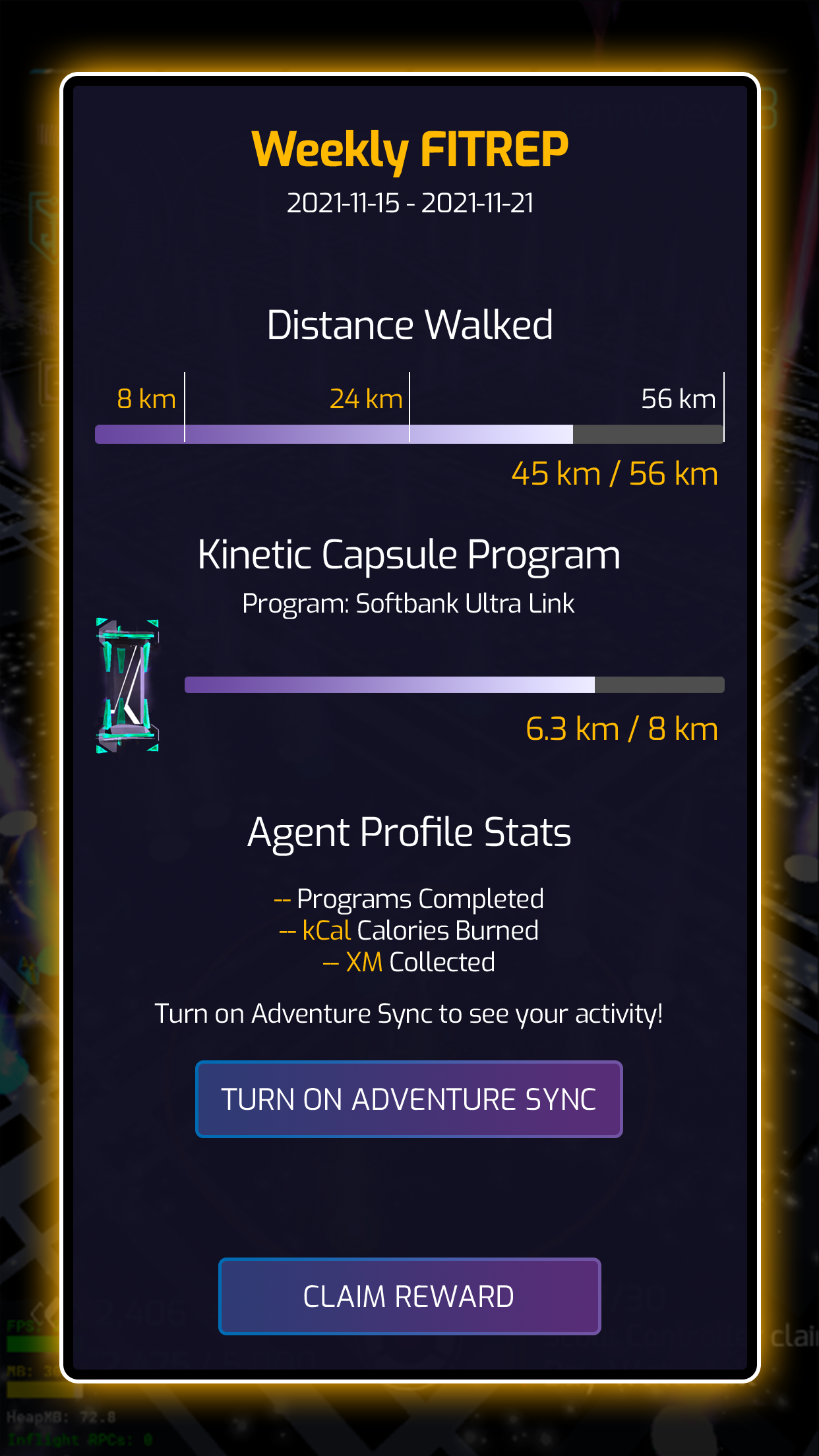
Weekly FITREP
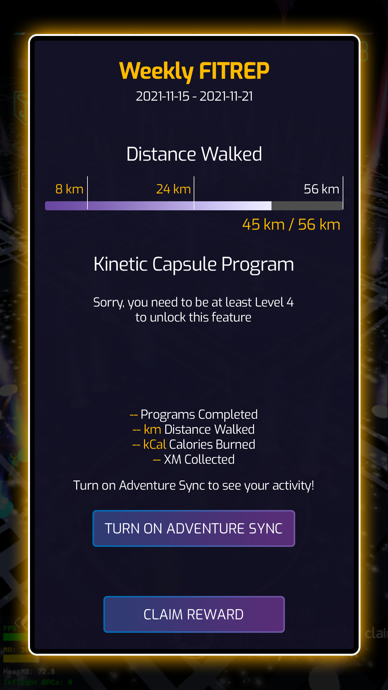
If Player is not yet Level 4
Adventure Sync is not turned on
Unclaimed Free Kinetic Capsule
Turn on Adventure Sync
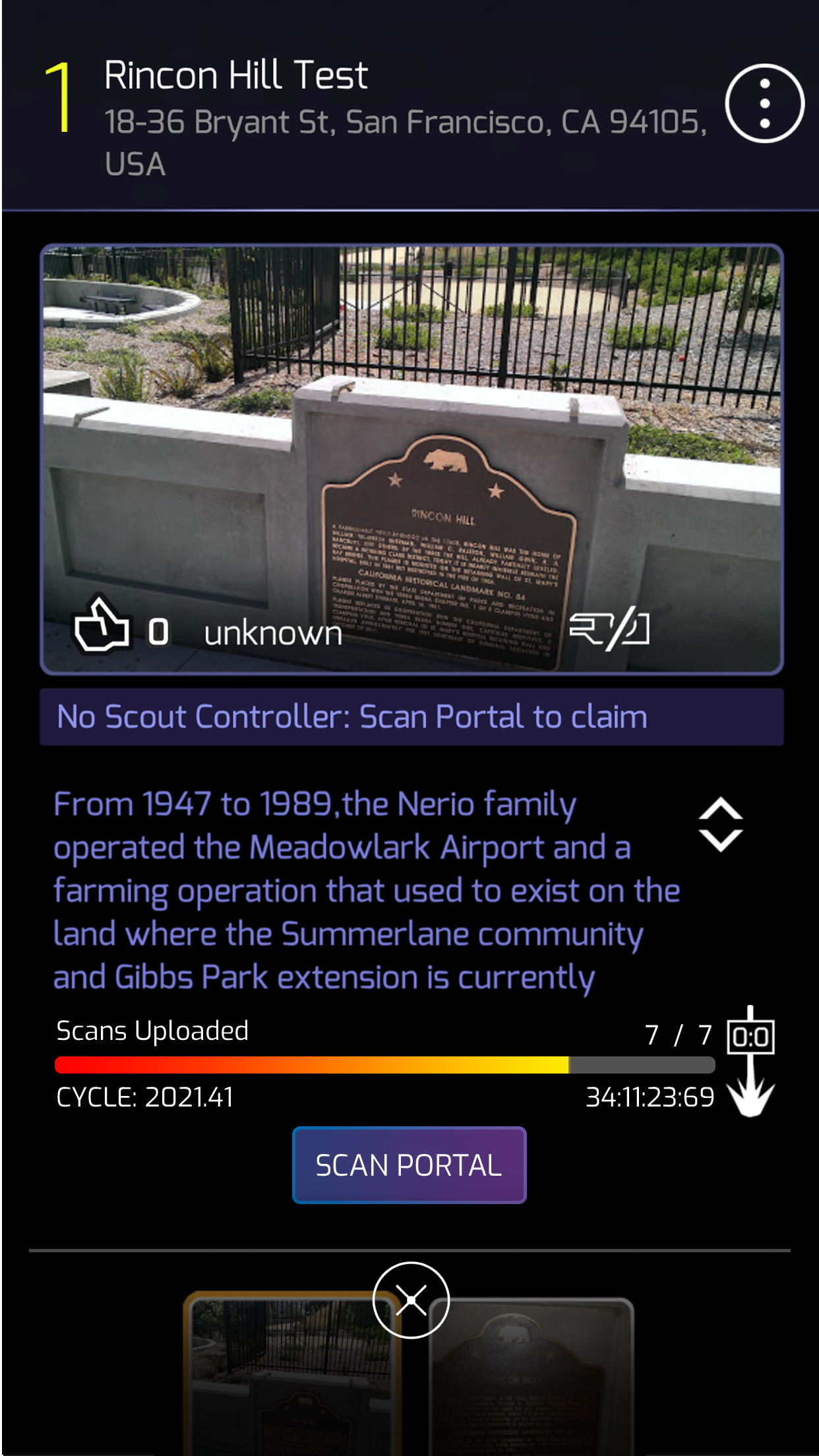
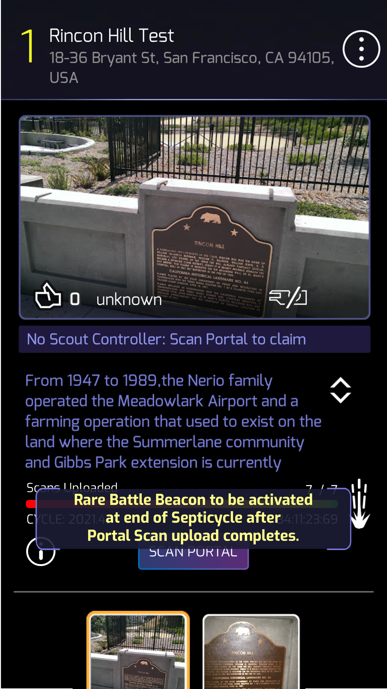
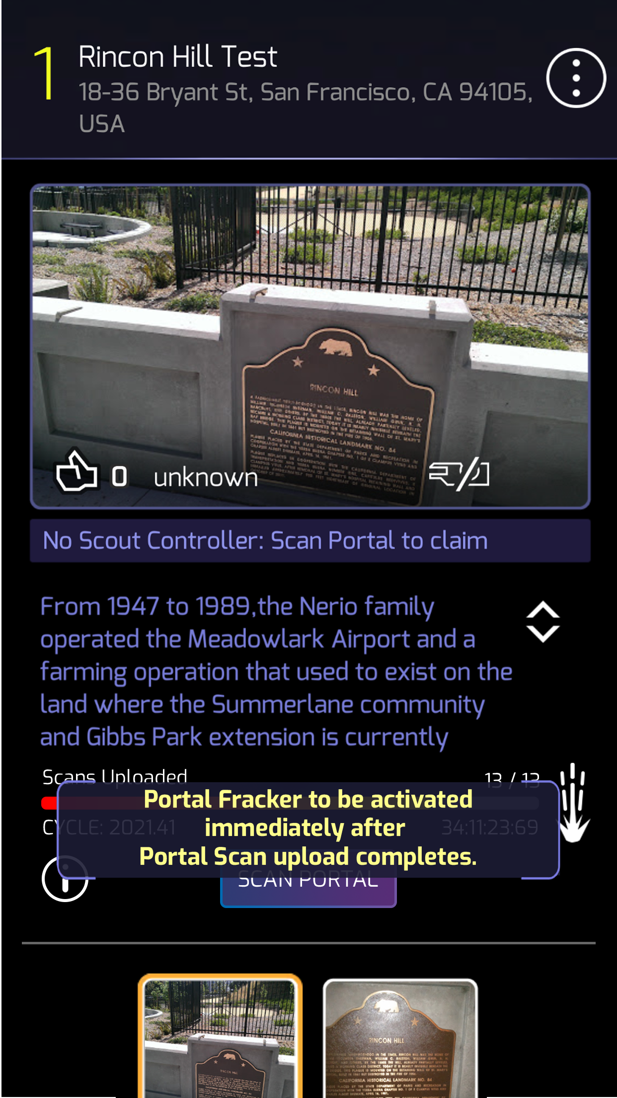
I designed the Portal Scan Meter
A progress meter that displays how many scans have been uploaded to a portal and indicates which mods will be applied once the meter is full.
Objective
To motivate players to create more portal scans and increase overall gameplay engagement.
Many players don’t see the value in creating portal scans, and some may submit low-quality scans in protest. Fewer daily active users result in fewer players gathering at portals and engaging with the game.
Final Design
Added to the existing portal details screen, a progress meter displays the number of scans uploaded for a portal. Once the meter reaches 7 scans, a Rare Battle Beacon will be deployed on the portal at the end of the week. When the portal reaches 13 scans, a Fracker is deployed immediately.