
HUNTER-ED+
Hunter-Ed+ is an upcoming, state-approved interactive hunter safety education program designed to fulfill mandatory licensing requirements through gamified, scenario-based learning. Once launched, the platform will replace traditional text-heavy coursework with self-paced interactive simulations and role-playing modules that cover firearm safety, hunting ethics, state regulations, and wildlife conservation. It will offer beginner hunters a practical, engaging way to test their decision-making in real-world hunting scenarios while earning their official hunter education certification online.
Role
Product Designer
Team Size
3 Engineers, 1 Product Manager/Writer, 1 Artist, and me
Company
Kalkomey Enterprises, LLC
Background
As the mobile-first evolution of ilearntohunt and hunter-ed, hunter-ed+ brings Kalkomey’s state-approved safety curriculum directly to modern smartphones. Modeled after boat-ed+, it packages essential lessons on firearm safety, ethics, and conservation into an intuitive, bite-sized mobile experience; making certification engaging and accessible anywhere. This course is meant to be on mobile device and web. It is slated for release in Spring 2027.
Key Objectives
Gamify the core experience to boost engagement and expand market reach, while establishing modular game mechanics and a scalable UI template to streamline future course production.
Technical Constraints and Design Restrictions
Standards & Rigor:
Strict IHEA compliance, mandated Bloom's Taxonomy levels per chapter, high content reuse, and 51 course variants (1 federal + 50 state-specific).
UX & Mechanics:
RPG-style gamification with redesigned mobile-first mechanics in a landscape/web layout.
Project Realities:
Rapid 5-month timeline, lean team size, and shifting direction and scope due to leadership changes.
UX Discovery & Core Loop Architecture
I started off by laying the Foundational Player Experience
I led the initial UX research phase to analyze our target demographic, define the core gameplay loop, and map out the complete end-to-end course flow. This involved identifying mobile-tailored visual styles, mapping the player journey across key phases from introductory trails to instructor touchpoints and chapter exams, and developing narrative concepts that turned rigid safety coursework into an engaging RPG-style experience.
To transition ilearntohunt into hunter-ed+, I led an extensive research phase to understand our target demographic, map real-world hunter behaviors, and translate mandatory safety concepts into an intuitive mobile UI.
1. Demographic Insights & User Behavior
I analyzed 2025 US hunter demographic trends to ensure our design decisions aligned with both our core audience and new user segments:
Audience Profile: The core hunter demographic spans ages 36 to 55 (average age 42 to 45). While historically male-dominated (around 90%), female entrants represent 33% of new hunters, highlighting an important growth segment.
User Motivations: Research showed that harvesting meat for food and participating in wildlife management are primary drivers, far outweighing pure sport or trophy hunting. Big-game hunting (specifically deer) dominates the market.
UX Strategy Implications: Because the user base leans older, the UI needed to avoid over-complicated menu structures or crowded layouts. The experience required clarity, large touch targets, and clean navigation while remaining welcoming to first-time hunters.
2. Art Style Strategy & Selection
To determine the visual direction, I evaluated art style preferences across our demographic groups:
Demographic Preferences: Men aged 45 and older express a high appreciation for classic art, realism, and traditional outdoor themes. Women aged 35 and older favor traditional styles featuring warm tones, detailed brushwork, and grounded aesthetics.
Comparative Map Analysis: I benchmarked several visual approaches:
NPS Style Map: Highly informative, but visually flat and unengaging.
Isometric Theme Park Map: Well-structured, but overly complex and chaotic.
Fantasy Style Map: Great warm aesthetic, but too disconnected from real-world hunting.
Graphic Style Map: Modern, but lacking the detailed grounded feel our audience prefers.
The Selected Direction: We chose an Open World Map art style. It offers a detailed, rich, and informative aesthetic that feels fun and adventurous without sacrificing educational credibility.
3. Mapping the Real-World Hunter Journey
I mapped the actual lifecycle of a hunter to create an authentic mental model within the app:
Preparation Phase: Covers education, regulations, scouting, and gear preparation. In the app, this is anchored at Basecamp.
Hunting Experience Phase: Involves navigation, field ethics, safety, and shot placement. In the app, this takes place along the Trail Map.
Post-Hunt Phase: Focuses on field dressing, game care, tagging, and reflection. This begins on the trail and transitions back to Basecamp.
To make the course feel like a journey rather than a rigid checklist, I introduced narrative elements where the user plays as the main character, giving them non-linear pathing choices within unlocked map areas.
4. Course Mechanics & UI Systems
I defined the core UX patterns to guide learners seamlessly through each chapter:
Visual Progression System: Designed a cohesive system using shape language, color coding, icons, and transparency to clearly differentiate between tappable vs. non-tappable elements, locked vs. unlocked paths, and completed vs. active stations.
Virtual Instructor Presence: Defined the Virtual Instructor as both a constant companion and a contextual guide. The instructor introduces lessons, provides teaching moments, and delivers post-lesson feedback based on player performance.
Dynamic Lesson Delivery: Structured transition moments where a representational avatar moves along the map trail before launching a lesson. Lesson background environments dynamically match the topic (for example, displaying Basecamp art during preparation modules) to maintain visual immersion.
Translating Research to Interface:
The Interactive Core Loop
Transitioning the strict, mandatory curriculum of standard International Hunter Education Association (IHEA) courses into an engaging mobile UI required moving away from a traditional "read-then-quiz" format. To bridge the gap between our foundational research and the final interface design, I mapped out the overarching user flow to establish a gamified Core Loop. This primary action-feedback cycle drives player engagement, reinforces core firearm safety rules, and establishes a rewarding rhythm that dictates all subsequent UI decisions.
I broke the overall flow down into a continuous, four-step behavioral loop that repeats across every chapter of the course:
1. Prepare & Brief (The Setup): The loop begins at Basecamp or a trail node. The Virtual Instructor introduces the specific learning objective. The UI presents clean, legible briefing modals—utilizing Montserrat typography for maximum readability across demographics; allowing the user to absorb contextual information before committing to the interactive path.
2. Explore & Apply (The Action): The user navigates the Trail Map, making deliberate pathing choices. The UI transitions from a passive learning state to an interactive one. Users engage directly with the environment, tapping through situational dialogues or identifying safe firing zones via prominent call-to-action buttons.
3. Assess & Feedback (The Challenge): Instead of a static multiple-choice quiz, the user faces a contextual field simulation. To make these assessments feel tactile and engaging on mobile devices, I designed distinct interactive states within Figma, employing techniques like subtle inner shadows on checkboxes to create a recessed, grounded effect during selections. Immediate, constructive feedback is provided based on the user's performance.
4. Reward & Advance (The Progression): Upon successful completion, the user is rewarded with a clear visual system update. The UI components transition states (e.g., a map node shifting from a pulsing "Active" state to a gold-accented "Completed" badge). This satisfying visual feedback unlocks the next segment of the map, seamlessly restarting the loop for the next topic.
UX Impact of the Core Loop: By defining this structural flow before building out high-fidelity screens, I ensured the component library was built around purpose-driven interactions rather than decorative screens. The predictable structure reduced cognitive load, allowing users to focus entirely on the subject matter while remaining motivated by the continuous visual progression of unlocking the open world map.
Evolving the UI:
Audits, Design Systems & Mobile-First Redesign
To build the visual architecture for the new platform, I needed to establish a unified design language that solved the technical and aesthetic debt of our previous products. This required bridging the gap between our most recent platform, Boat-ed+, and the highly outdated legacy content of ilearntohunt..
1. Platform Audits & Establishing a Template Mindset
I began by conducting a comprehensive audit of the existing boat-ed+ app. While it served as a strong baseline, I documented numerous opportunities to improve usability, interaction design, and visual hierarchy. Instead of treating these as one-off fixes, I used these insights to construct a foundational design system in Figma.
My goal was to design with a "template mindset.” To create a scalable library of reusable UI patterns that could dynamically adapt to different lesson types, rather than custom-designing individual screens. This approach ensured consistency and dramatically accelerated the development handoff.
2. The Legacy Challenge: Rescuing ilearntohunt
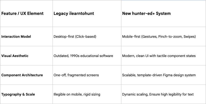
The biggest hurdle was auditing the legacy ilearntohunt platform and extracting its existing interactive lessons. The legacy interactives suffered from severe usability issues:
Outdated Aesthetics:
The visual design felt akin to early-1990s educational PC software, completely disconnected from modern UI expectations.
Lack of Mobile Responsiveness:
The interactives were originally built for desktop screens and fundamentally failed on mobile devices. They lacked basic, expected mobile gestures (such as pinch-to-zoom or swipe navigation) leaving mobile users frustrated by unreadable text and unreachable touch targets.
3. The Mobile-First Redesign & Component Library
I systematically redesigned every single interactive from the ground up, translating the old desktop concepts into the newly established, template-driven design system.
To ensure the new interactives felt tactile and responsive on mobile devices, I focused on several key UI principles:
Tactile Interactive States:
I built out robust Figma component sets with clearly defined active, hover, and disabled states. For example, I utilized subtle inner shadows on checkboxes and selection inputs to create a recessed, grounded effect that visually confirms a user's tap.
Clear Call-to-Action Hierarchy:
I standardized all primary call-to-action buttons with high-contrast styling and generous hit areas to confidently guide users through complex learning simulations without second-guessing their next step.
Modern, Legible Typography:
I implemented Montserrat across the platform. Its geometric, sans-serif structure provided excellent legibility on small screens while maintaining a modern, clean aesthetic that elevated the product out of its "90s edutainment" legacy.
Navigating Directional Pivots & Scope Constraints
Transitioning the platform into a Unity-based environment introduced significant directional pivots, driven by iterative script revisions from the Product Manager and leadership's push to heavily gamify the experience. Balancing these ambitious game mechanics against strict educational requirements and technical realities required flexible, responsive UX strategies throughout the project lifecycle.
1. The "Hub and Spoke" Map Architecture
The initial architectural vision for the course map centered on a "hub and spoke" navigation model to maximize the feeling of an open-world game. Basecamp served as the central hub, with different "trails" (representing individual course chapters) radiating outward like spokes. The intended user flow required learners to select a trail, navigate to its end, complete the chapter exam, and then physically return to the Basecamp hub to unlock and choose their next path. This conceptual framework aimed to give players a strong sense of agency and geographical grounding.
2. Scope Adjustments & Resourcing Realities
As development progressed, the Product Manager initiated multiple rewrites of the course script, which severely impacted the project timeline. Ultimately, the PM made the decision to scrap the hub and spoke map design entirely, citing mounting schedule pressures and development resourcing limits. I had to rapidly pivot the UX strategy, adapting the interface to a more streamlined, linear navigation model that could still deliver a game-like feel without the complex branching logic and heavy development lift of the original hub design.
3. Redesigning the Assessment Loop for Bloom’s Taxonomy
Leadership's mandate to utilize Unity’s interactive capabilities meant replacing the legacy platform's standard multiple-choice and true/false quizzes with something significantly more engaging. Furthermore, we needed to ensure our assessments met the cognitive rigor required by Bloom’s Taxonomy.
We realized that by building multi-stage interactions that required users to reference earlier learning points, we could hit higher-level educational requirements while making the assessments feel like actual gameplay. I restructured the core quiz loop into a dynamic, scenario-based progression system:
Scenario Presentation:
The user is placed in a practical field scenario rather than reading a static question.
Review & Discovery:
Rather than forcing an immediate, penalized guess, the interface affords the user a chance to review contextual clues or navigate back to deduce the correct answer.
Multi-Part Application (Part B):
The assessment expands into a follow-up question that builds directly on the initial scenario, testing applied knowledge rather than mere memorization.
Constructive Failure & Hard-Gating:
If the user answers incorrectly, the Virtual Instructor steps in to explain exactly why the choice was unsafe or incorrect. The user is then given subsequent chances to solve the problem.
Mastery Requirement:
To ensure absolute comprehension of firearm safety and hunting regulations, progression is strictly hard-gated. The user cannot proceed to the next module until they successfully navigate the scenario and find the correct answer.
Visual Evolution & Resource Management
As the interactive mechanics of the course evolved, it became clear that inheriting the rigid boat-ed+ design system would not support the gamified, modern direction leadership wanted. I led a visual pivot toward a sleek, minimalist aesthetic characterized by refined typography, ample negative space, and tactile components.
1. Pivoting the UI and Getting Scrappy with Art
We initially planned to just inherit the boat-ed+ design system to save time. But as the course mechanics became more gamified, that rigid corporate look just wasn't cutting it. I pushed for a sleeker, modern interface using lots of negative space, clean typography, and tactile components.
The prolem was that we only had one dedicated artist. There was simply no way they could crank out the massive amount of custom environmental and character art this new look demanded on our timeline. Instead of scaling back the design, we got scrappy. We pulled older legacy illustrations from ilearntohunt and housed them inside polished modern UI containers. By using consistent corner radii, deliberate cropping, and clean drop shadows, we framed the older art so it felt intentional and stylized rather than outdated. This let us bypass our biggest bottleneck without sacrificing the new aesthetic.
2. Adapting the Story and Scrapping the Parallax
Those same resourcing limits also forced a pretty big pivot in how we told the story. Originally, we wanted the user to feel like they were physically walking the trail alongside their instructor. We had planned out these awesome animated parallax backgrounds that would seamlessly transition through different biomes depending on the lesson.
When the parallax biomes proved to be too much of an asset lift for a single artist, we had to adapt the narrative delivery. We moved that immersive environmental storytelling into the linear map and contextual lesson modals. It still gave users that crucial sense of journey and progression but delivered it in a much leaner way.
An example of a prototype of what the parallax instructional lessons could look like
An example of a prototype of what the parallax instructional lessons could look like, with the map drop in to show current location and upcoming obstacles.
3. Slowing Down the Spam-Tappers
Finally, because hunter-ed+ is an official safety certification, we couldn't just let users spam-tap their way through the virtual instructor dialogues to finish quickly. They actually needed to absorb the material. To enforce this, I added a two-second delay before you could advance to the next screen.
Waiting on a frozen screen is awful UX, though. To keep users from thinking the app was broken, I designed a continuous visual progress ring around the "Next" button. It starts as an inactive black arrow, and over those two seconds, a green stroke sweeps around the circular track. Once it hits 100%, the arrow snaps to green and becomes clickable. It was a simple micro-interaction, but it completely solved the pacing compliance issue without frustrating the user.
An example of a prototype of what the parallax instructional lessons could look like with the delayed tap to continue
4. Drawing Inspiration from Games
Since we were pushing for a gamified feel, I spent a lot of time researching UI design across different games. I specifically looked at landscape mode, how casual and indie titles handled their narrative elements, dialogue systems, and choice buttons. I wanted to see how they balanced character portraits, text progression, and screen space without overwhelming the player. This research directly influenced how we structured our virtual instructor conversations. Instead of dumping heavy paragraphs of educational text on the screen, we broke the script down into digestible dialogue boxes that felt natural to tap through. It made the dense safety material feel much more like an interactive story.
Designing the "Field Day" Practicals: An Experiential Approach
To cap off each of the app’s five "Trails" (chapters), the team wanted to recreate the hands-on environment of a real-life hunter education "Field Day." Because we were building in Unity, we had a unique opportunity to push the boundaries of standard e-learning. Rather than building a traditional, high-stakes exam with rigid right-or-wrong interactions, the goal was to create a highly immersive, stress-free learning environment.
The team leaned on my background in narrative fiction mobile gaming and match-3 game design to conceptualize the flow. I knew that complex game mechanics could distract from the educational goals, so I focused on pacing, environmental storytelling, and character engagement.
The Core Mechanic: First-Person Exploration
Instead of dropping users into a punishing simulation, we positioned the player in a first-person POV. The user acts as a student attending a virtual field day, moving seamlessly from table to table to learn from instructors and interact with the environment. This "table-to-table" progression keeps the cognitive load low while maintaining a highly engaging, story-driven progression.
Here is how we translated the curriculum into five distinct, narrative-driven practicals:
Trail 1: The Foundations of Safety
Because the first chapter is entirely dedicated to safety, the practical introduces a core narrative element: peer dynamics. The user meets and befriends a fellow student who begins making questionable safety decisions. Rather than simply clicking the "correct" safety rule, the user is prompted to actively speak up to their new friend for safety and ethical reasons. This approach tests the user's knowledge through relatable social friction, turning a dry safety lesson into a memorable narrative beat.Trail 2: Equipment and Maintenance
This practical focuses on the tactile elements of the sport. As the user moves through the field day stations, the experience focuses on the step-by-step procedures of loading, unloading, transporting, storing, and safely cleaning firearms. The first-person perspective allows users to familiarize themselves with the spatial and sequential requirements of equipment handling without the pressure of complex interactive mini-games.Trail 3: In the Field
The third practical drops the user into applied, situational awareness. Moving through the virtual stations, the user covers a wide array of field scenarios: safe field handling and carries, establishing zones of fire, and safe shot selection. We also integrated environmental challenges like hunter positioning, crossing obstacles, tree stand safety, and the importance of hunter orange, rounding the experience out with vital survival and first-aid protocols.Trail 4: Laws, Regulations, and Wildlife ID
Designing an engaging experience around laws and regulations can be difficult, so we leaned heavily on visual and scenario-based learning. This practical station serves as a comprehensive overview of wildlife identification, general hunting regulations, and dynamically loaded, state-specific legal requirements, ensuring the user feels prepared for their local compliance.Trail 5: Ethics and Responsibility
The final capstone practical brings the experience full circle, moving beyond rules and mechanics to focus on the human element of hunting. It reinforces the weight of ethical decision-making, respect for wildlife, and the ongoing responsibility the user carries as they graduate from the virtual field day and step into the real world.
A video of the click through prototype I created for Trail 1’s Practical.
System Architecture: Entry, Navigation, and the "Basecamp" Hub
Beyond the core educational practicals, the application required a robust structural framework to handle user onboarding, course navigation, and progress tracking. The goal was to create a comprehensive user interface that natively fit the hunting theme while delivering the intuitive navigation expected in a modern mobile experience.
1. The "Basecamp" Menu System
To keep the UI immersive, we themed the main navigational menu as "Basecamp." Accessible via a persistent toggle button, Basecamp serves as the user’s central toolkit throughout their learning journey. Opening the toggle reveals a beautifully structured menu containing six core features:
The Map
We designed a visual representation of the user’s course progress to ground them in their journey. Rather than a standard, clinical progress bar, the map allows the user to see exactly where they are across the five trails.The Glossary
A dedicated reference guide housing essential hunting terminology. To encourage progression and prevent cognitive overload, the terms are initially hidden and progressively unlocked as the user advances through the course, creating a sense of discovery.The Journal
This feature serves a vital dual purpose. For the user, it provides a helpful, written summary of everything they have learned so far. On the regulatory side, it cleverly satisfies the International Hunter Education Association (IHEA) requirement to have all official course writing fully documented and accessible within the app itself.The Profile
The central hub for gamification. This screen houses all the different rewards, badges, and achievements the user has earned by completing lessons and practicals.Settings
The control center for the app’s accessibility features, housing the language selection options, sound effect toggles, and voice narration controls.Exit Course
A formal exit sequence that ensures user progress is safely saved before returning them to the company's Main Hub.
2. The Trail Lifecycle: Starts, Practicals, and Exams
Creating a predictable, engaging rhythm for the user was essential for pacing the educational content. We established a standardized lifecycle for how users interact with each chapter from start to finish:
Starting a Trail
Each trail begins with an onboarding sequence that outlines the learning objectives and sets the stage for the upcoming lessons, cleanly guiding the user into the educational content.Reviewing Lessons
Before transitioning from the learning modules into the testing phase, the system provides a structured introduction to the exams. Users are prompted with opportunities to review past lessons and consult their newly unlocked glossary terms, ensuring they feel confident and prepared.The Practical Reward Screen
Immediately following the immersive "Field Day" practical, the user lands on a comprehensive reward screen. Designed with clean interactive states, call-to-action buttons, and highly legible typography like Montserrat, this screen provides total transparency on their performance. It visually breaks down exactly how many questions and interactive elements they got right or wrong throughout the entire trail. This acts as both a gamified celebration of their progress and a targeted feedback loop before the final test.Exams and Trail Ends
Armed with feedback from the reward screen, the user is transitioned into the formal exam phase. Upon passing, the trail officially concludes. The system updates the user's Map, celebrates their milestone, and unlocks the next chapter, seamlessly starting the lifecycle over again.
Foundational Interactives: A Templatized Design System
The final major component of the project was developing the foundational interactives—the core mini-games and engaging modules that users encounter repeatedly throughout the course. Instead of custom-building every single interaction from scratch, the objective was to create a scalable, unified system that could support diverse educational material.
To achieve this, I built a highly templatized design system utilizing a component-based architecture in Figma. By standardizing the visual language and interactive states, I created a versatile toolkit of UI assets. This included establishing clear hierarchies with Montserrat typography for high readability across devices, and designing consistent, tactile UI elements—such as call-to-action buttons and checkboxes utilizing inner shadows for a clear recessed effect during interactive states.
By designing these foundational interactives as flexible structural canvases, the workflow for the rest of the project was drastically simplified. The development and content teams could easily take these templates and plug in the specific curriculum content without needing bespoke design adjustments for every screen.
This modular pipeline efficiency extended far beyond just the mini-games. Because the system was so rigorously templatized, we were able to seamlessly populate the content for all lesson components across the entire app. The exact same foundational templates were adapted to house narrative dialogues, multiple-choice quizzes, lesson start and end screens, and the complex scenarios within the "Field Day" practicals. Ultimately, this templatized approach ensured a cohesive, intuitive user experience across all five trails while significantly accelerating our production timeline.